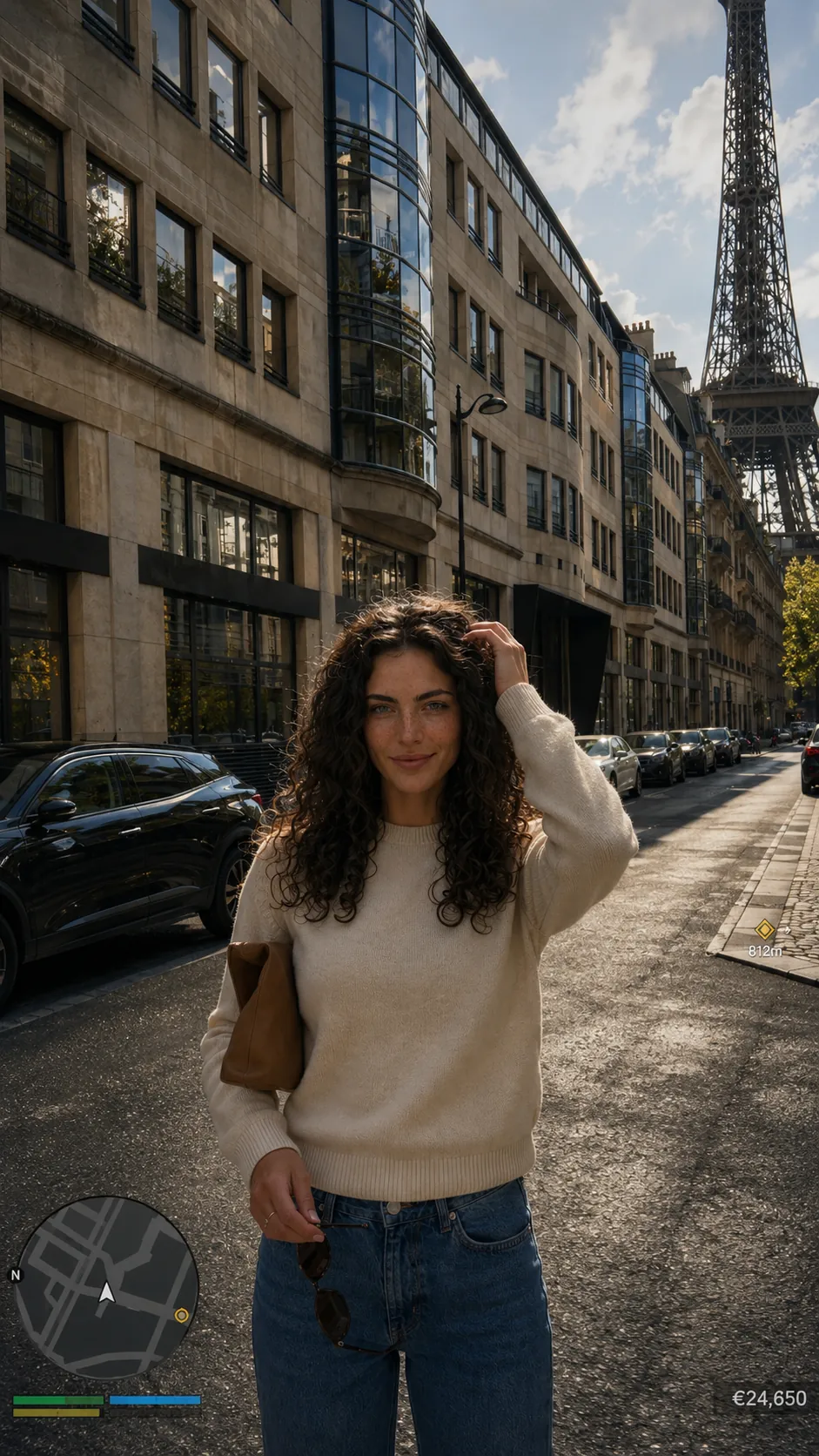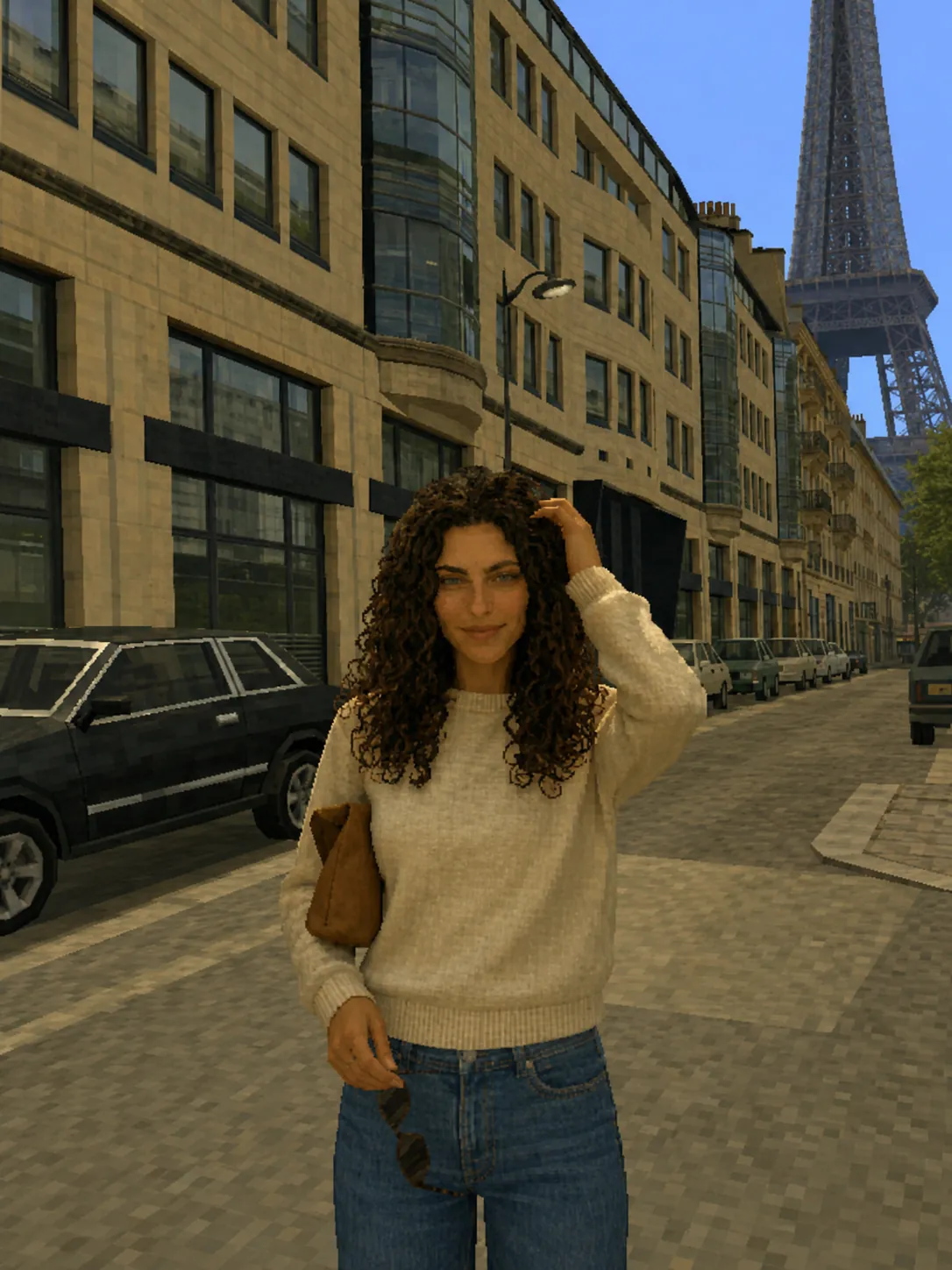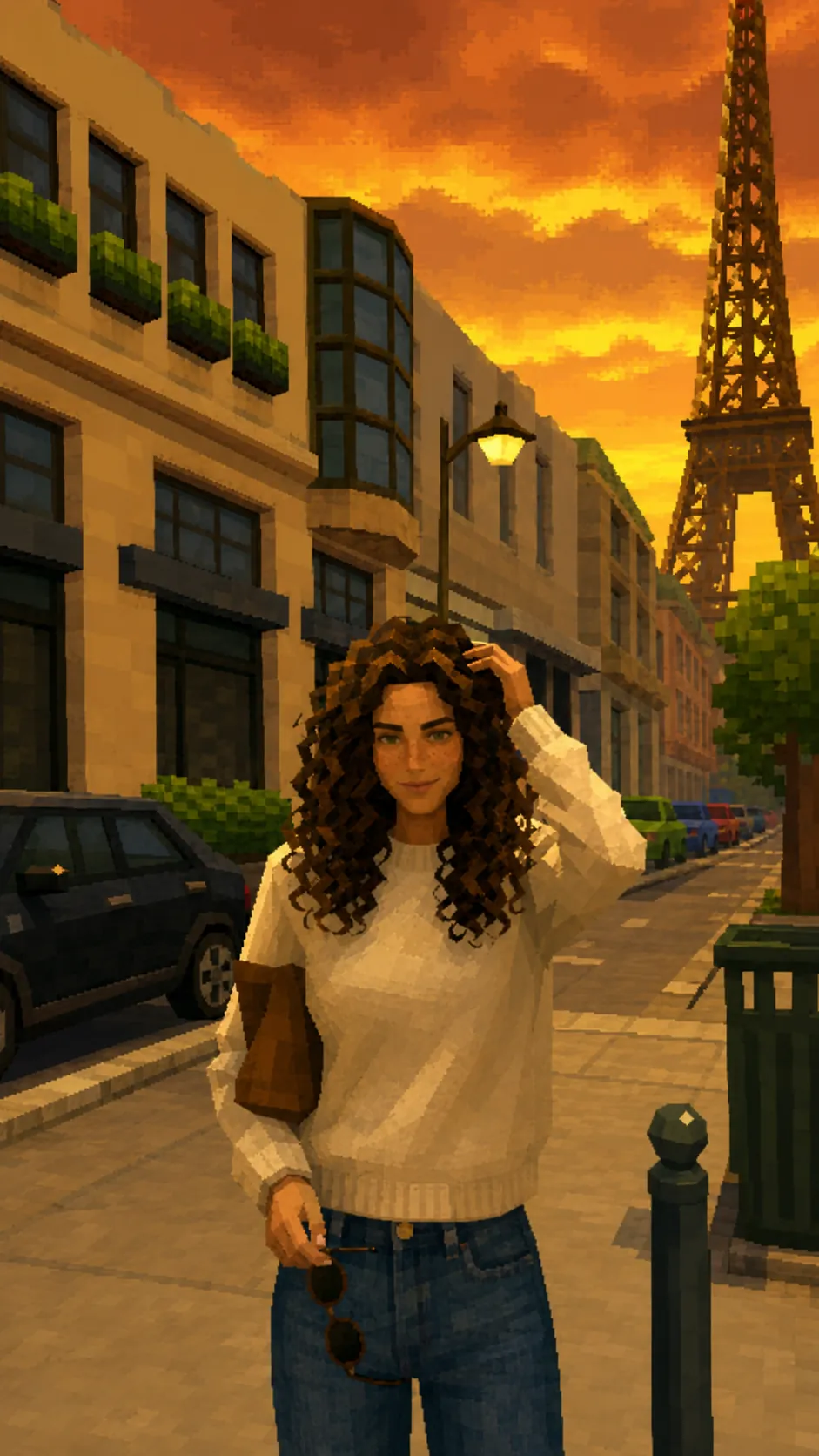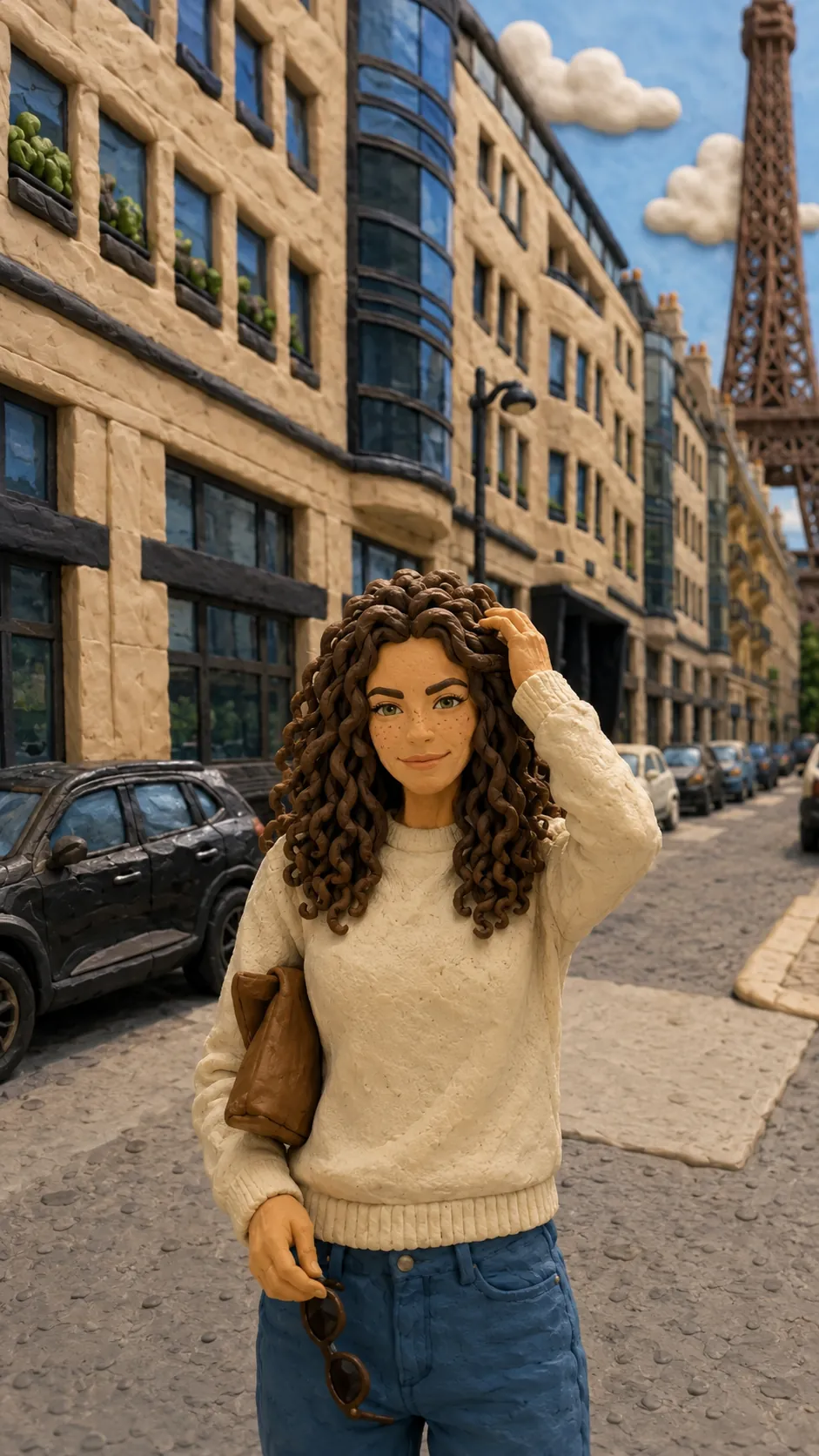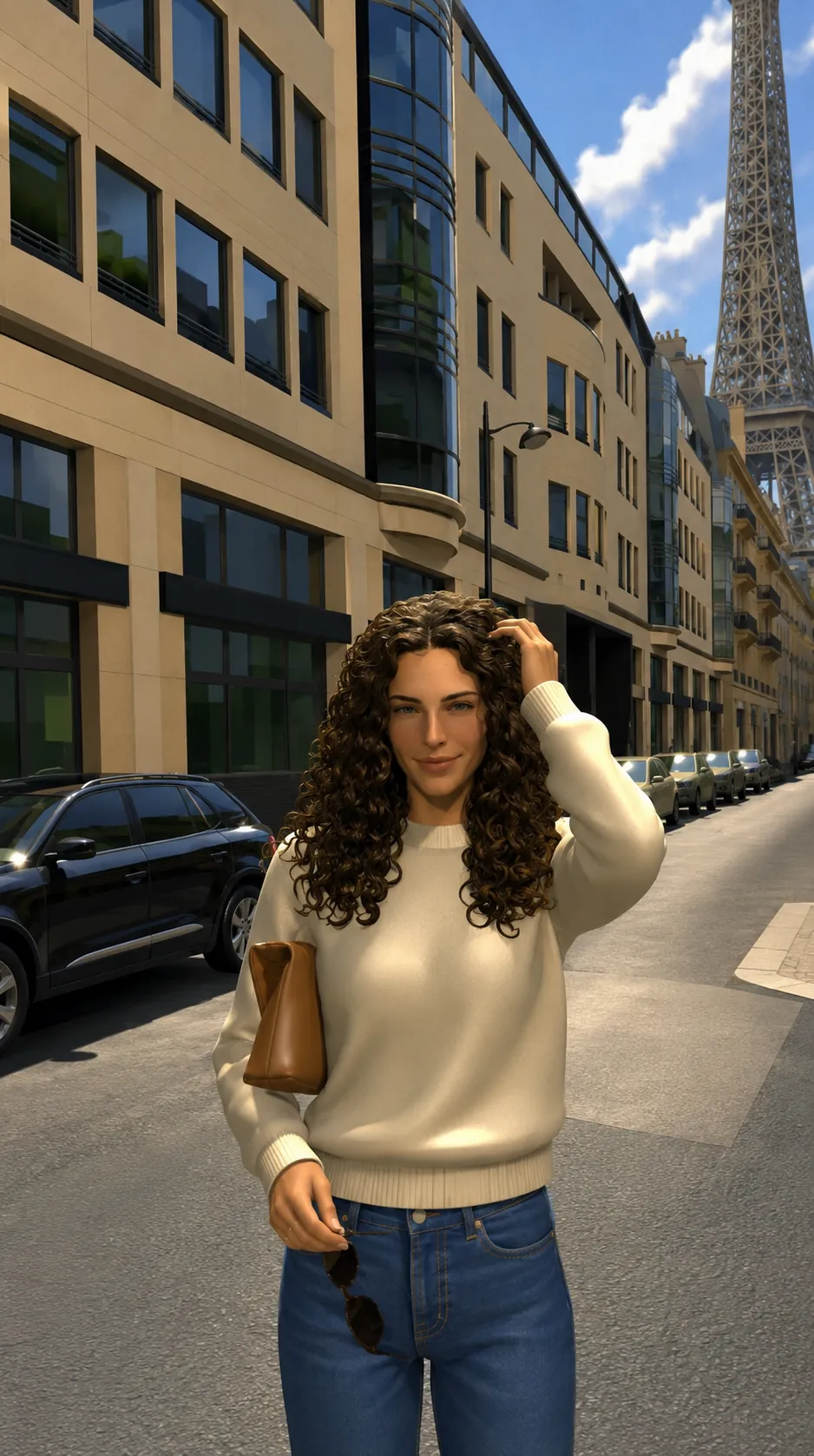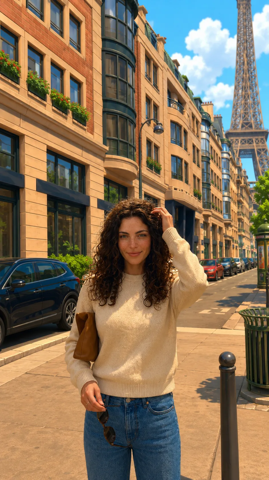
Bright stylised open world
Clean simplified geometry, saturated daylight and polished real-time materials.
Style transfer
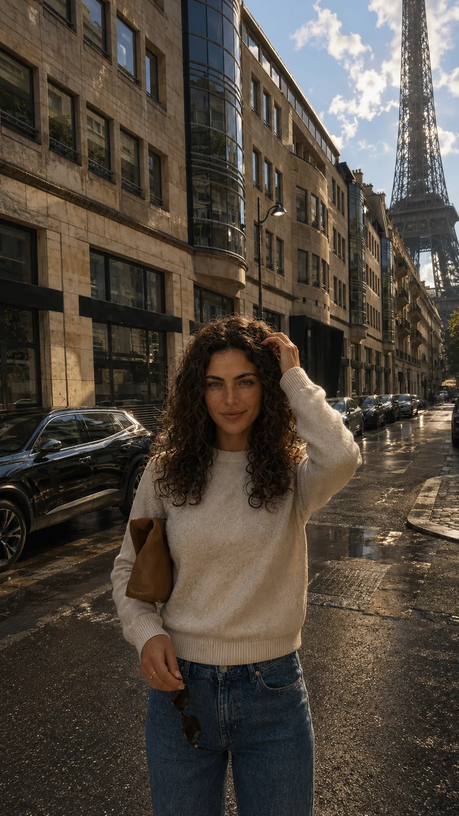
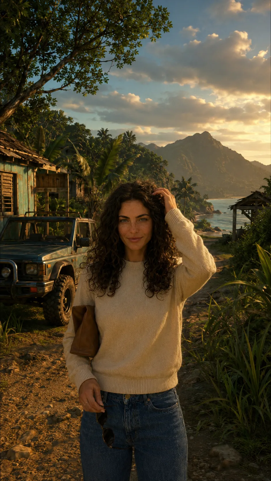
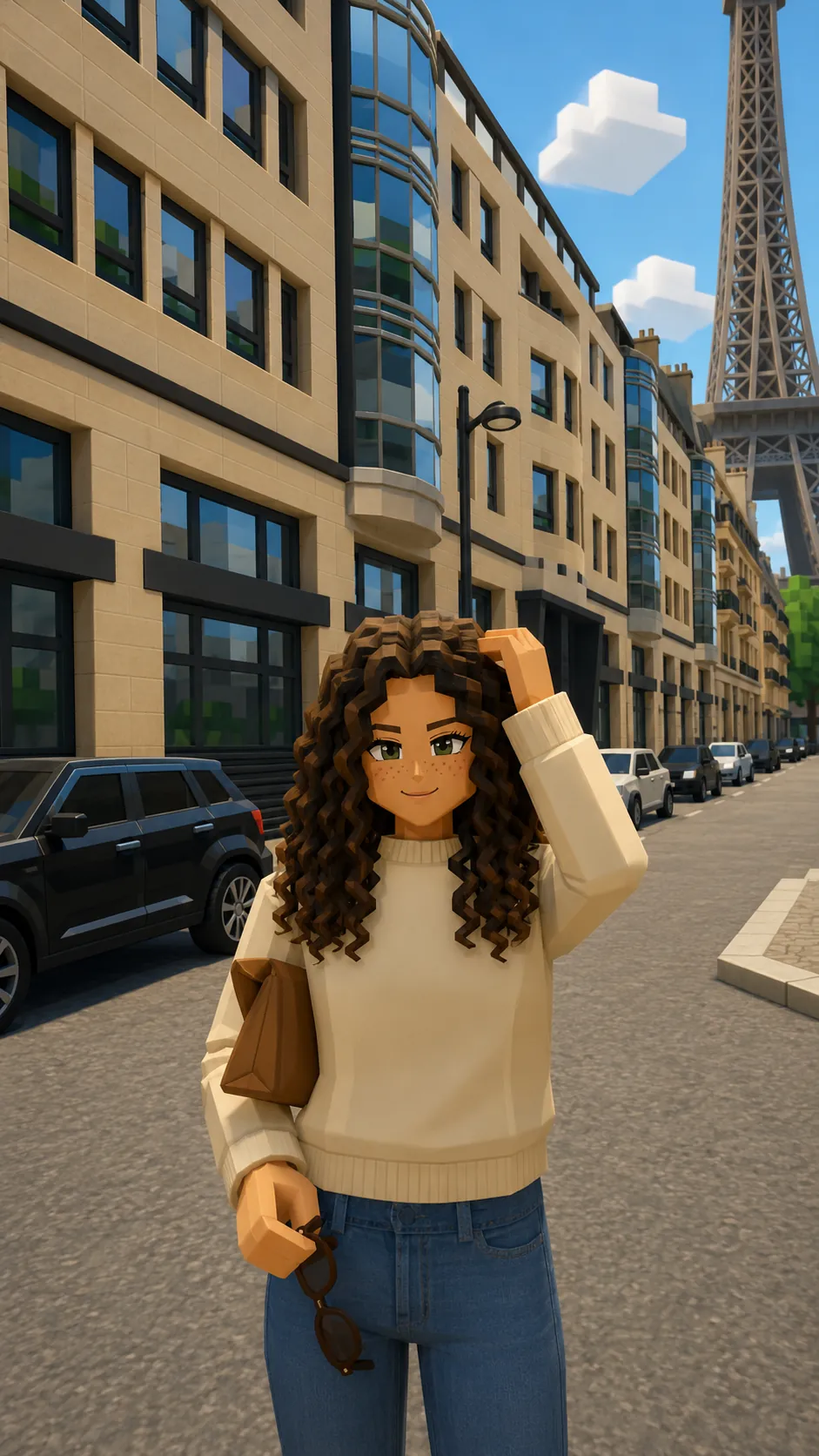
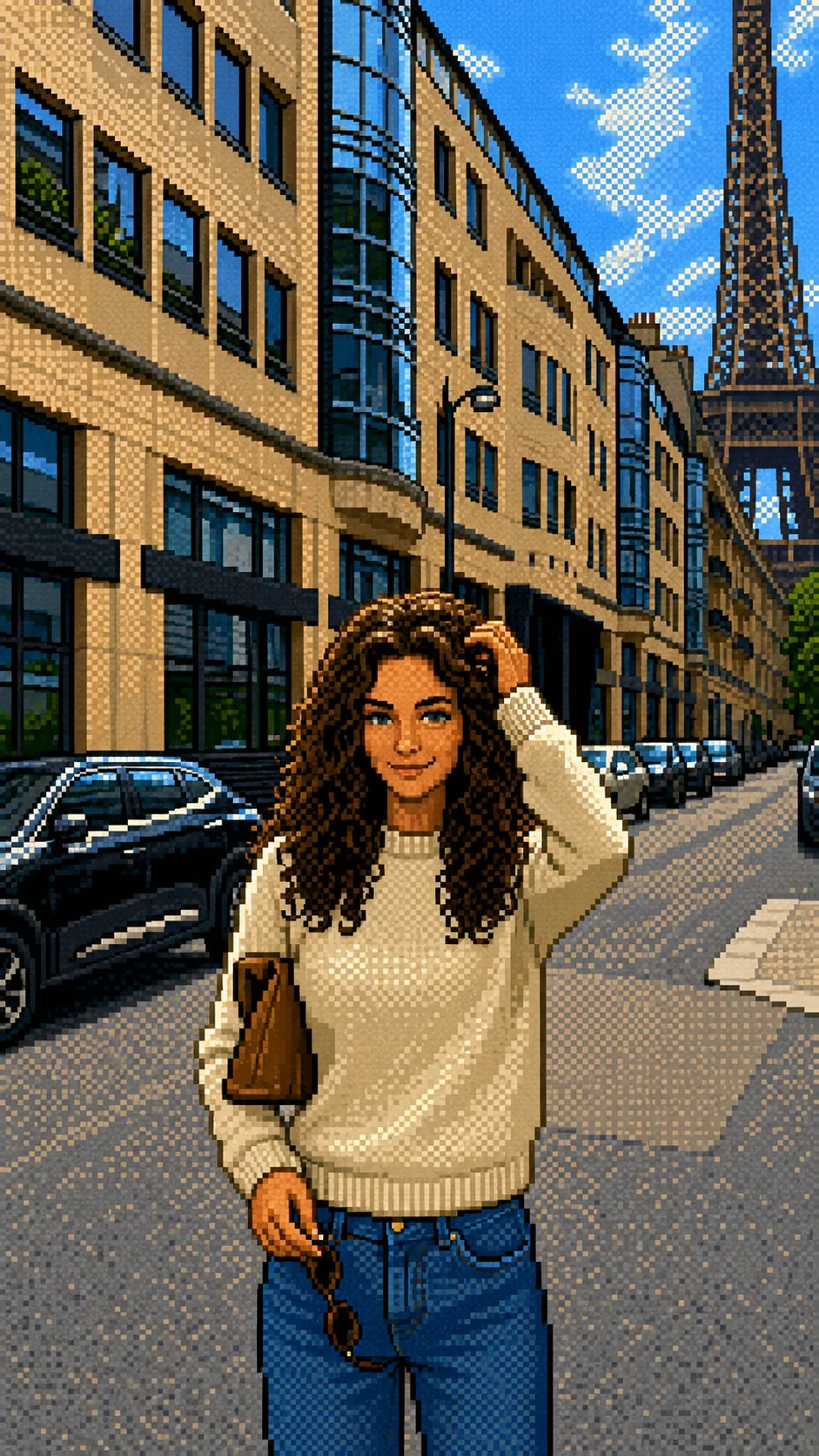
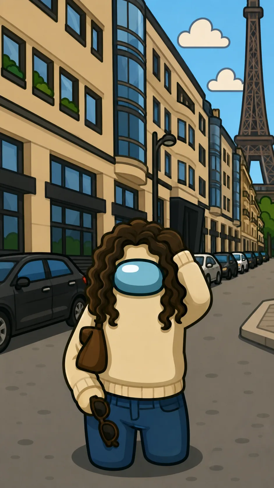
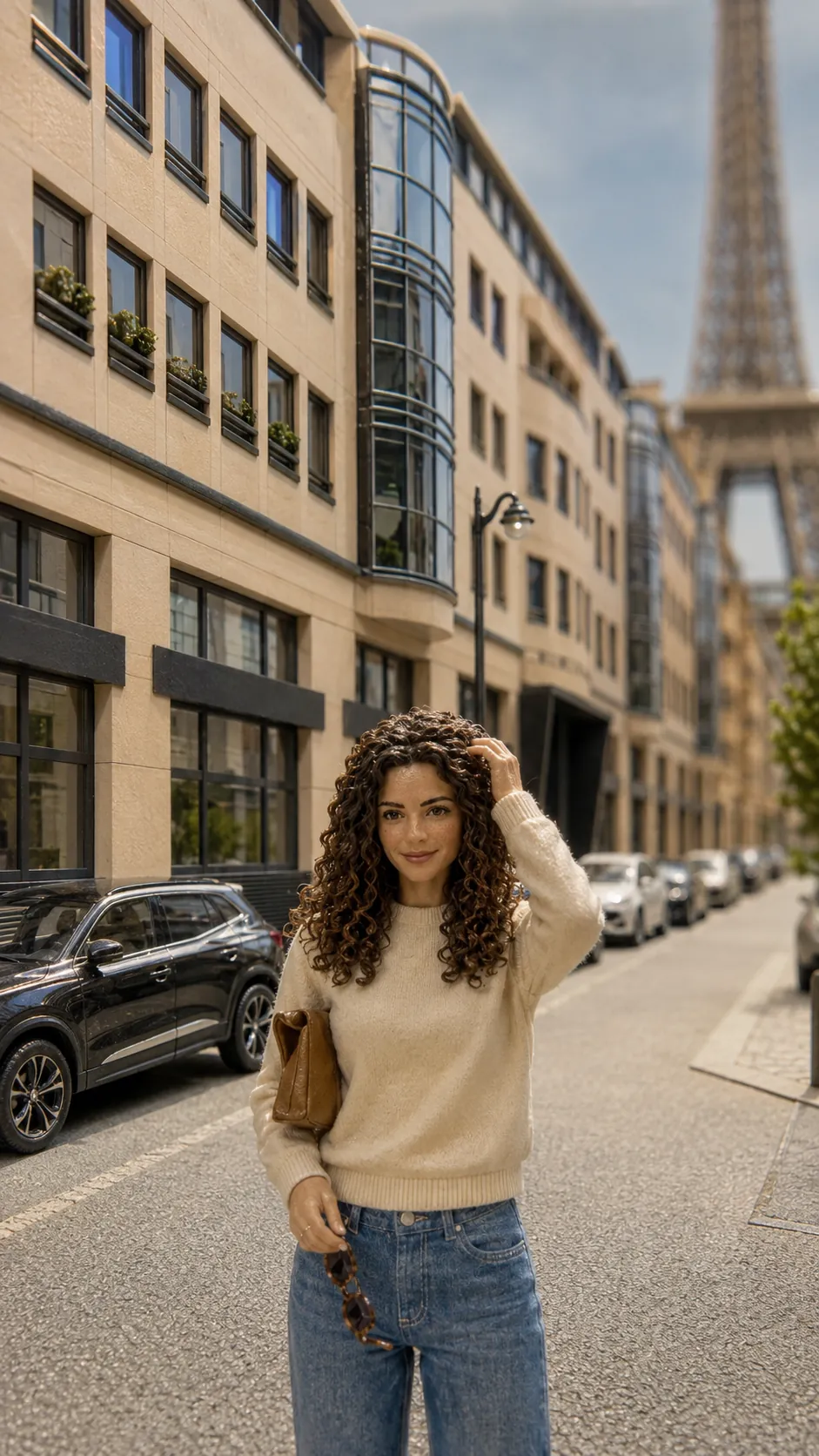
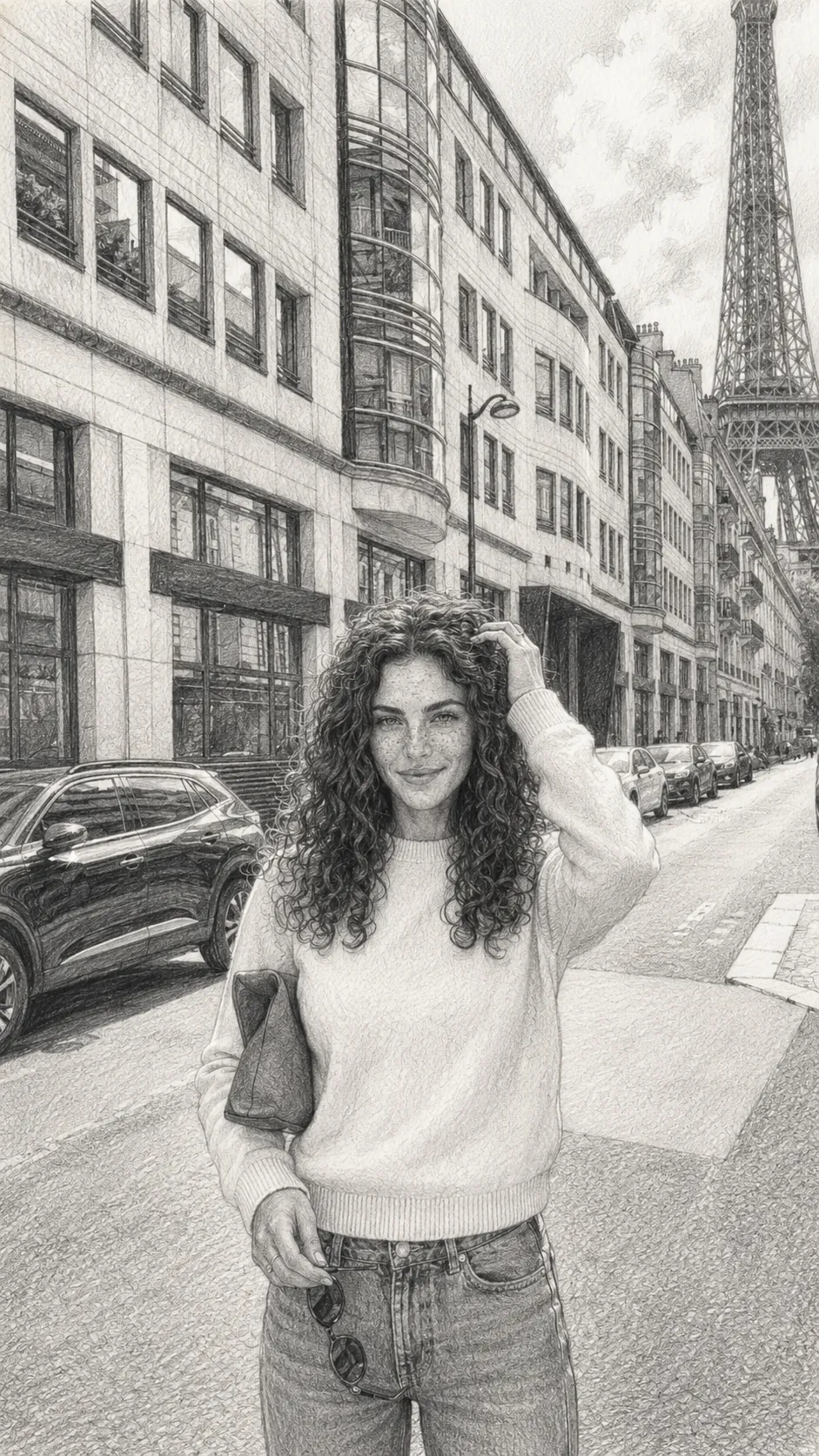
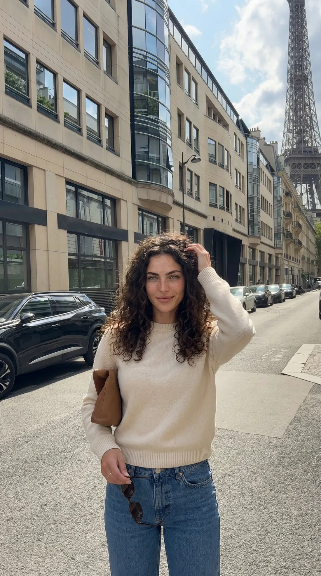
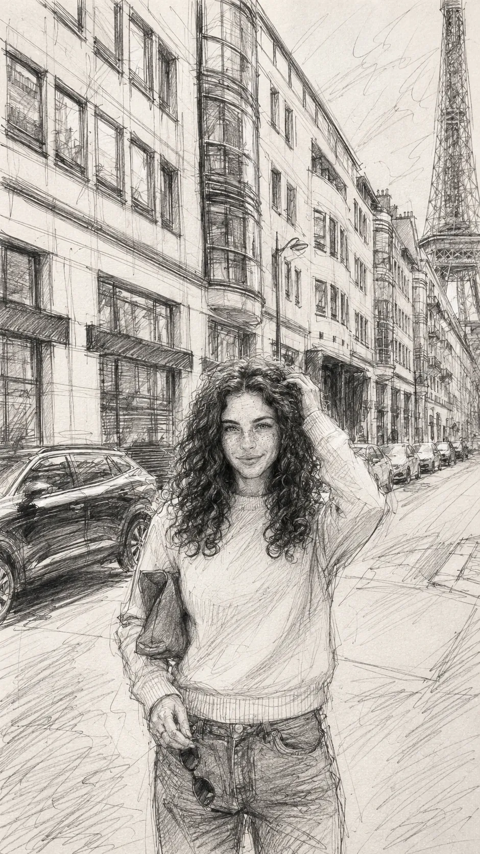
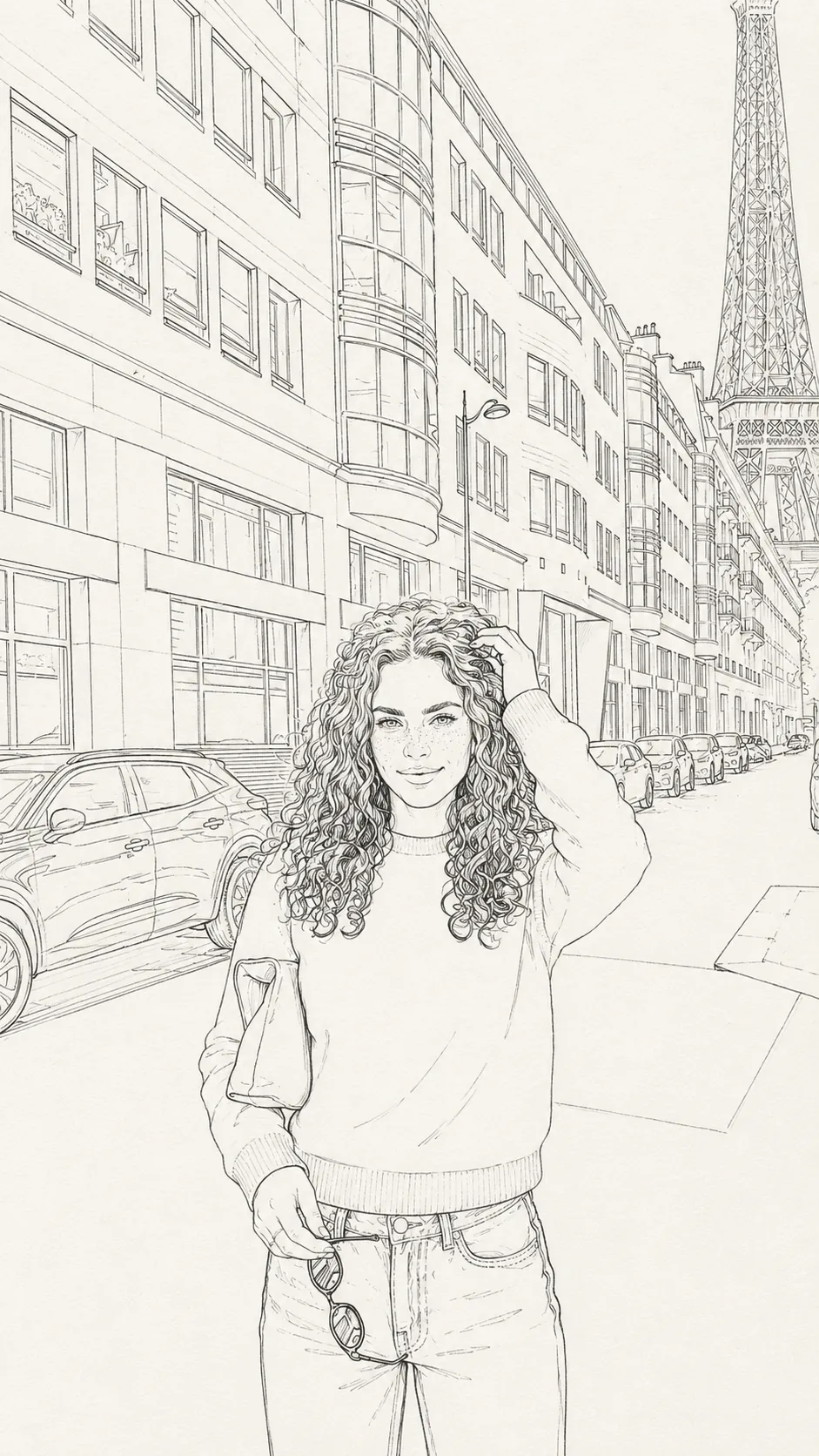
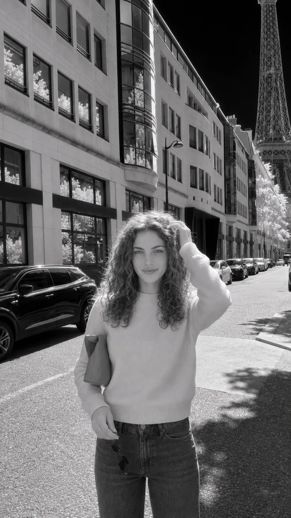
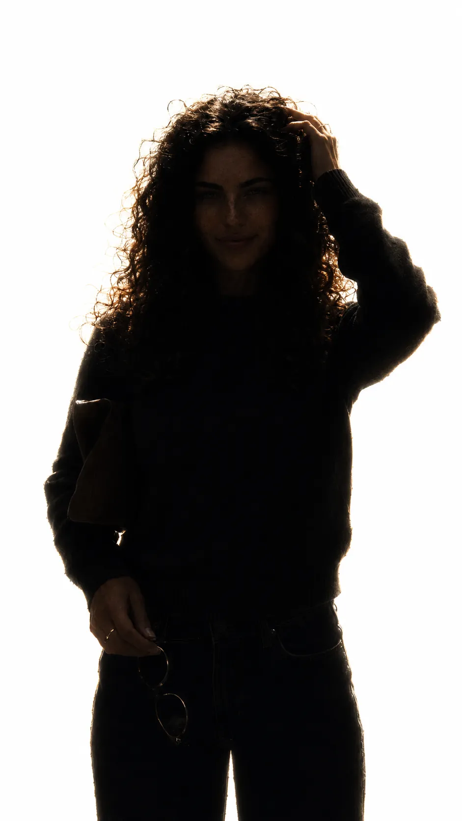
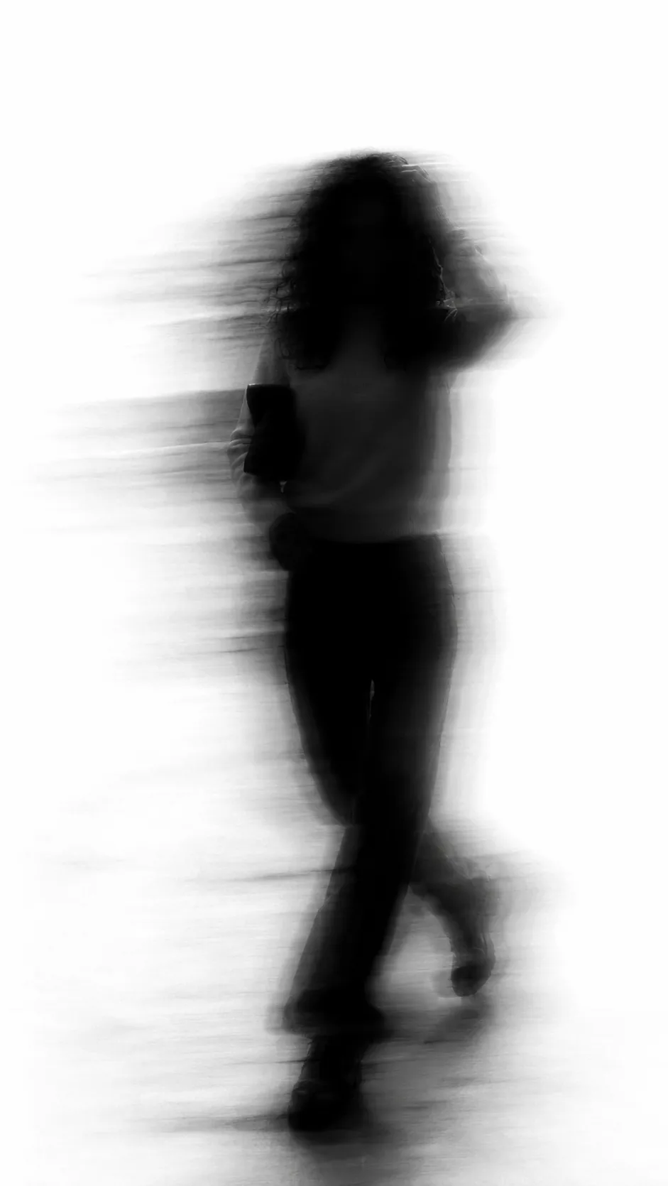
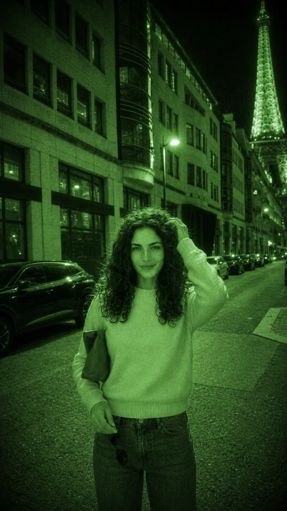
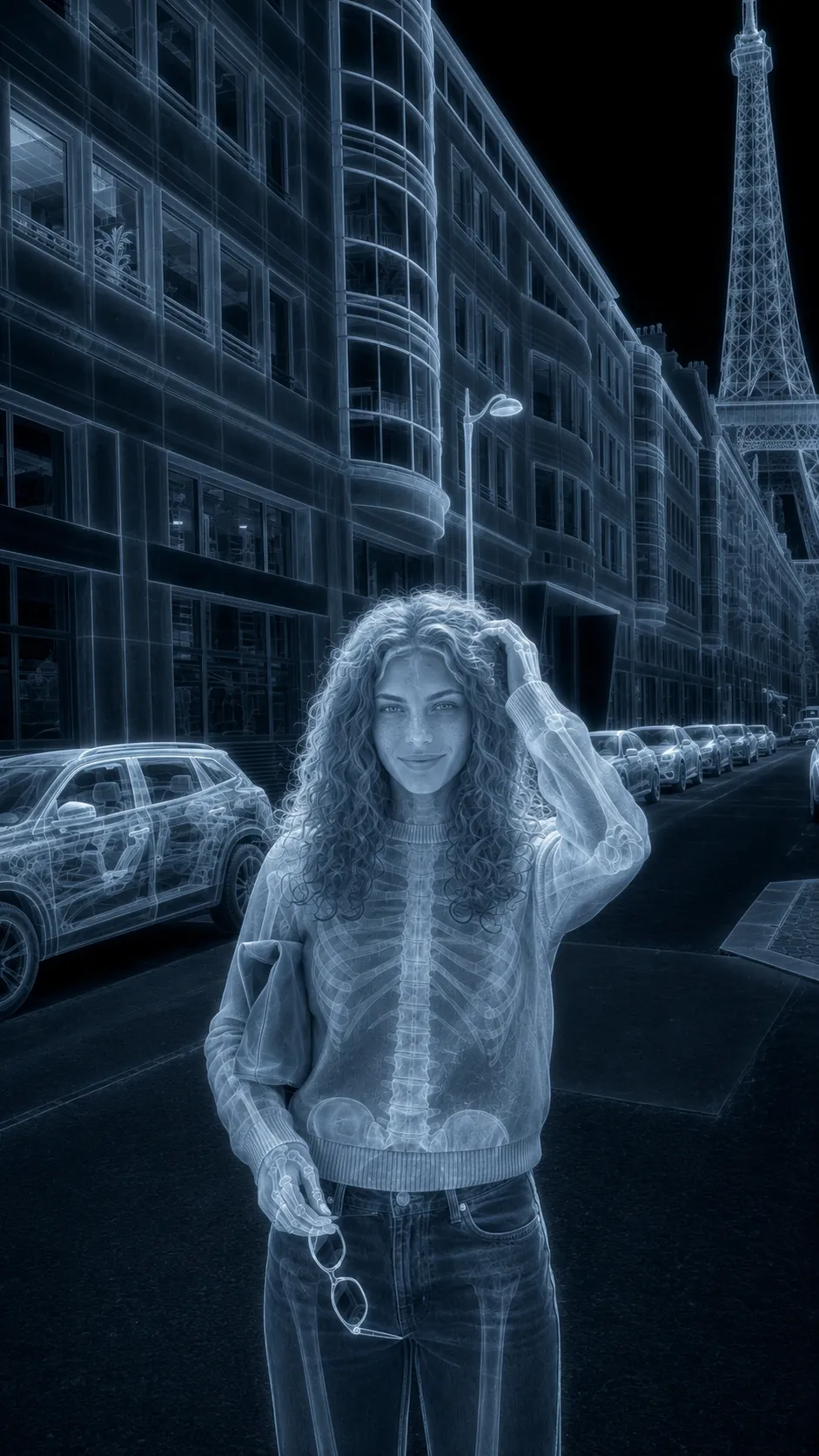
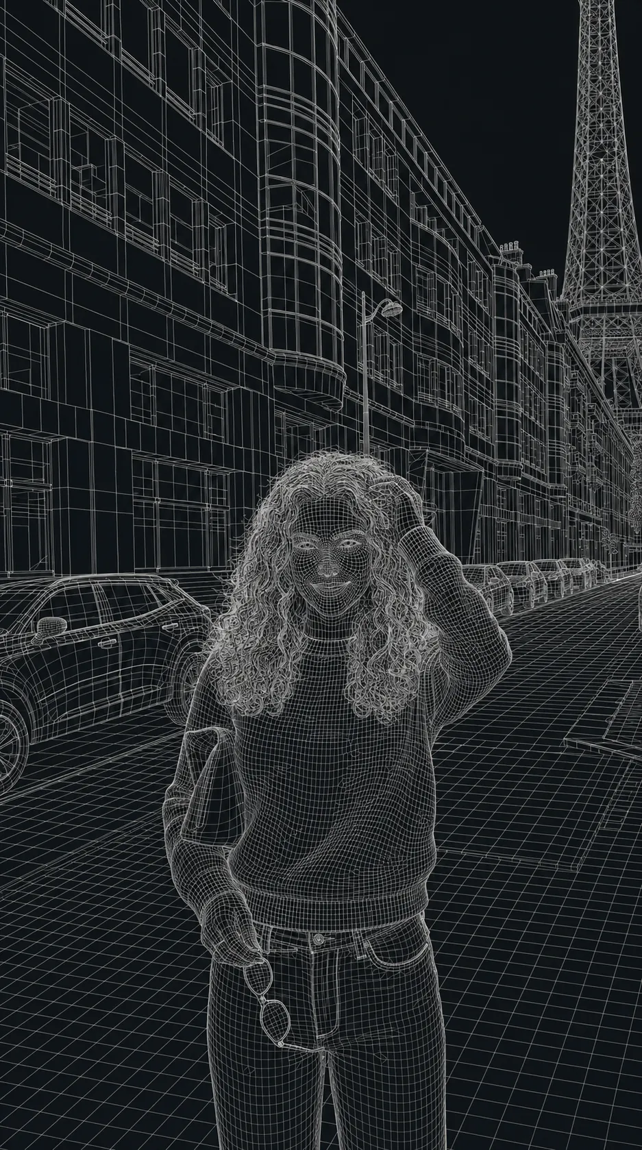
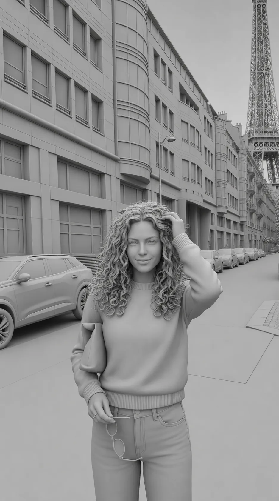
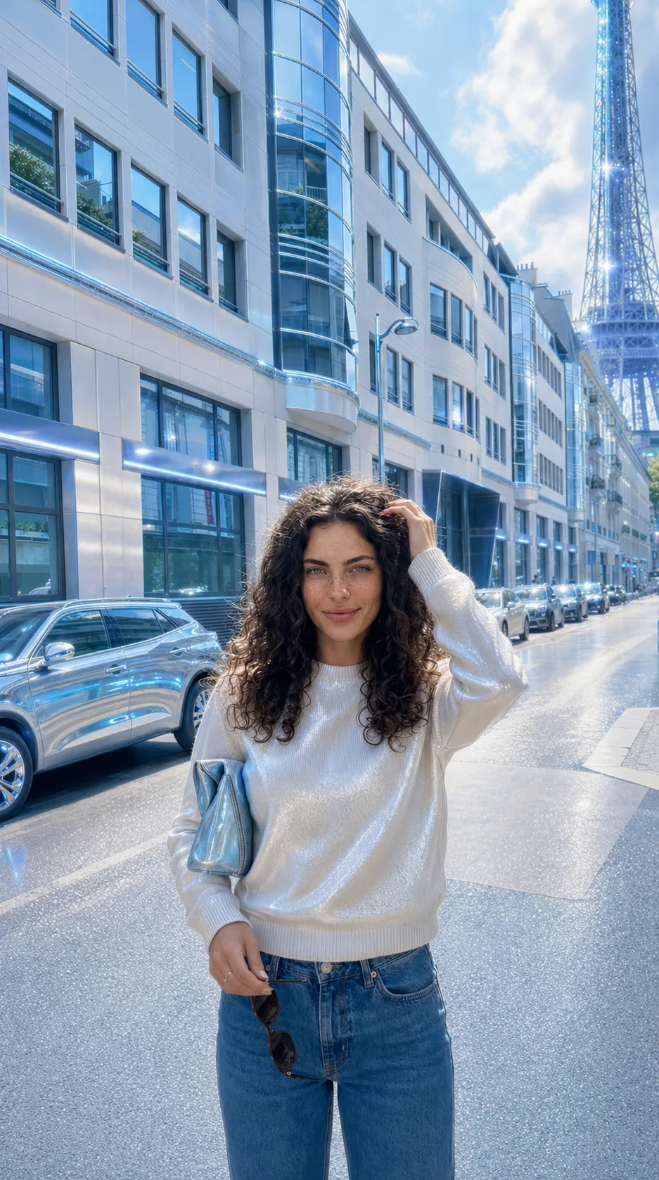
Every frame here began as the same photograph. What each prompt pins down is written into that prompt: most hold the pose, the person, the scene and the camera, and let the rendering do the rest. Some deliberately let go of more, because a depth map that kept its colour would not be a depth map. The point was never that nothing moves. It is that what moves gets decided before anything is generated, instead of being discovered in the output afterwards.
50 is where the set has got to, not where it stops. New transfers land here as I make them, and every number on this page is counted from what is actually on it.
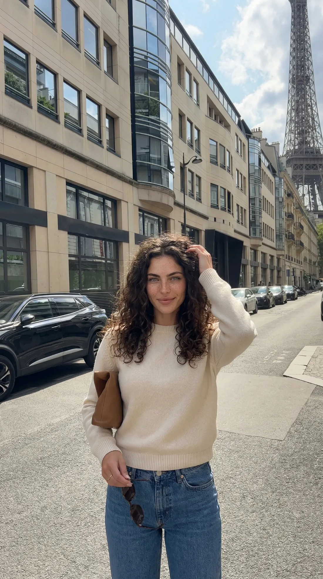
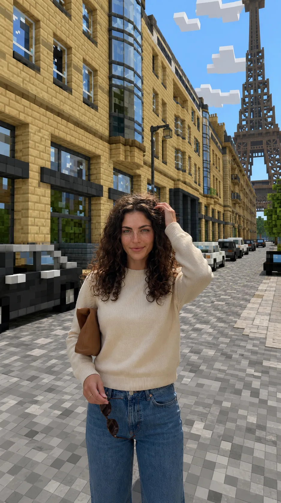
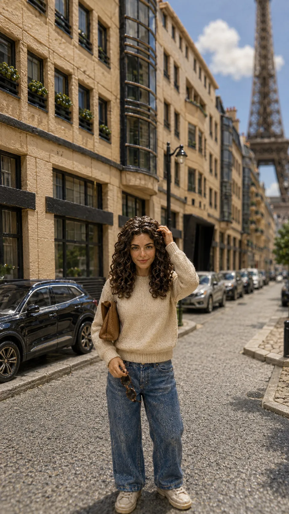
The source frame
What the prompts pin down
Counted from the preservation instructions in the 50 prompts themselves. Nothing is held across all of them, and it should not be: a wireframe has no lighting to keep and an x-ray has no palette to protect. Each frame lists its own.
The subject is my own character, generated and owned outright. That is why she can turn up this many times over with nobody’s permission but mine.
The set
Open any one to wipe between the source frame and the transfer, and to read what that prompt was told to hold. Search by look, or narrow to a family.
Real-time engines across four console generations, from baked shadows to global illumination.
6 of 6
Clean simplified geometry, saturated daylight and polished real-time materials.
Current-generation open world at gameplay fidelity, with the street dressed as an in-game district.
Low-poly geometry, baked lighting and a draw distance that gives up early. The tower still reads.
Chunky low-detail forms, soft low-resolution textures and dreamy sunset light.
Physically based materials, global illumination and screen-space reflections, rendered as though caught mid-session rather than posed.
Dense tropical planting, warm natural sun and slightly dated real-time rendering.
Everything on a grid: sprites, cubes and faceted planes, where the resolution is the point.
7 of 7
Blocky avatar proportions, simple materials and a platform look that reads instantly to anyone under fifteen.
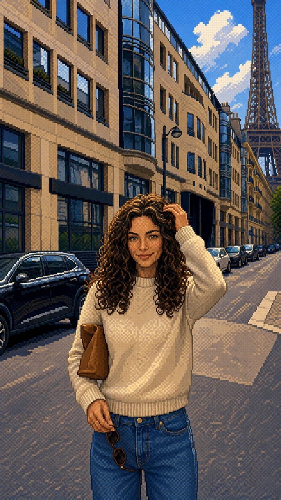
A tight palette, chunky sprites and hard pixel edges, held to what an eight-bit tile set could actually draw.
Flat cartoon proportions, thick outlines and a visor where a face used to be.
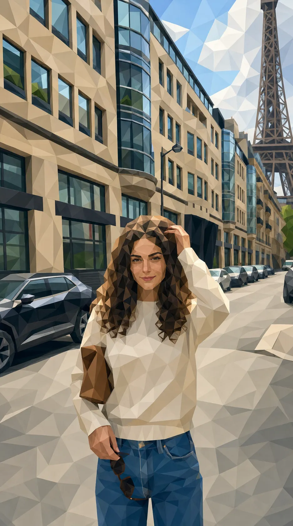
Faceted planes and visible triangles, with flat shading doing the work of detail.
Deliberate pixel placement with limited colour and clean dithering, at a resolution you can count.
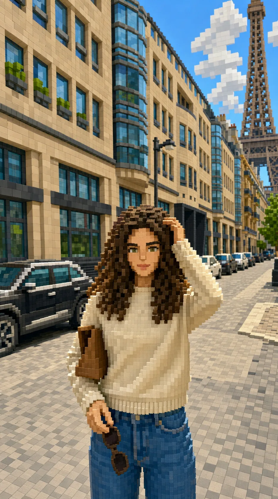
Cubic volumes on a consistent grid, where the resolution is the whole aesthetic.
The location rebuilt as cubes while the subject stays entirely photographic. The most interesting instruction in the set: one thing changes, one thing must not.
Frame-by-frame disciplines, drawn and built, from cel painting through to clay.
6 of 6
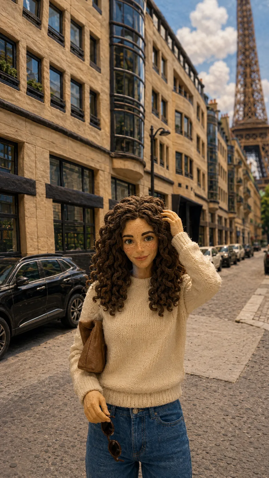
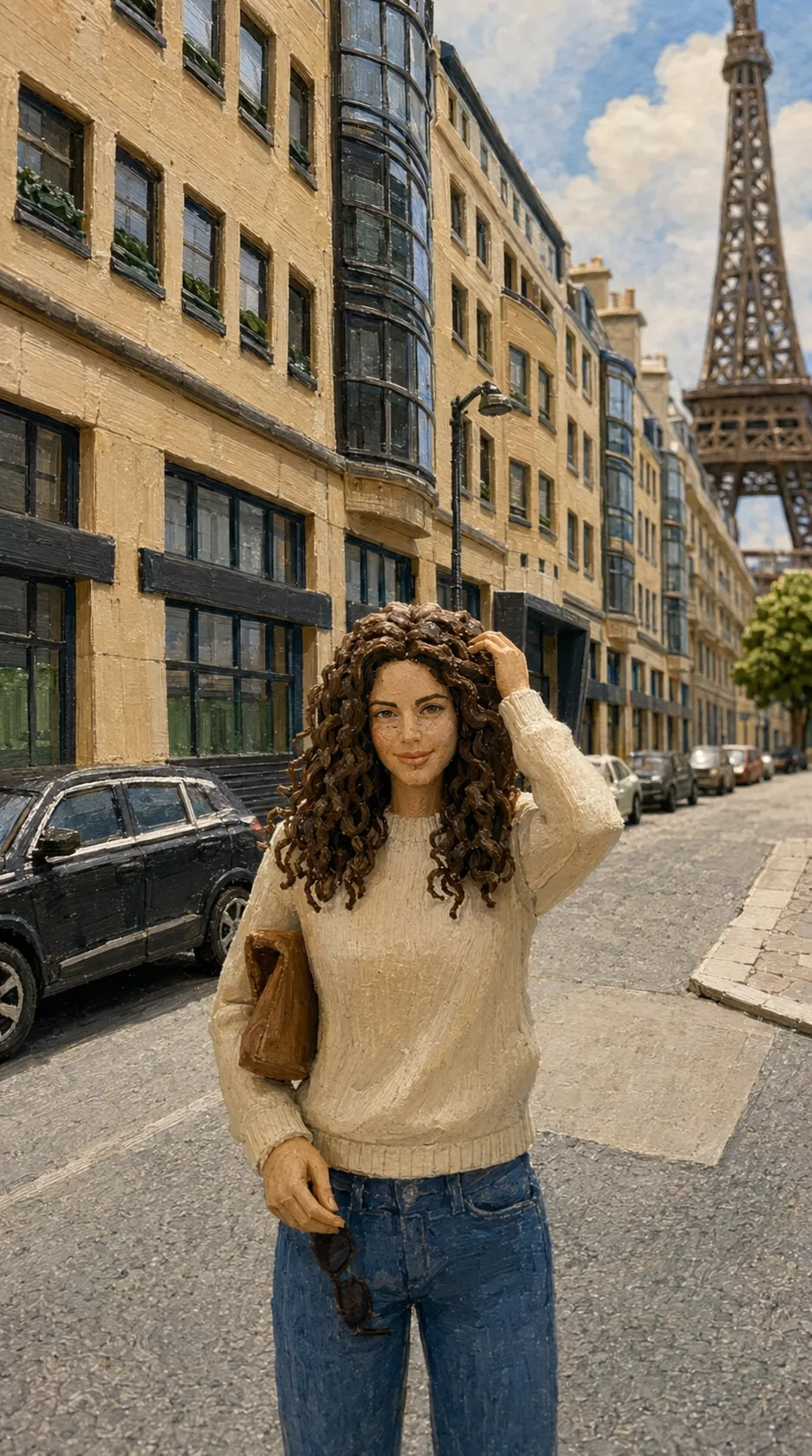
Fingerprints in the clay, uneven surfaces and the slight wobble of a frame-by-frame build.
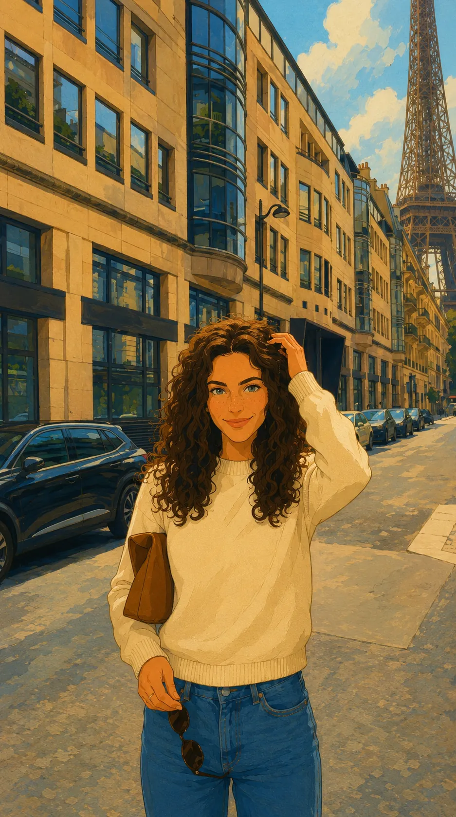
Clean ink lines, flat fills and painted backgrounds sitting on a different plane to the figure.
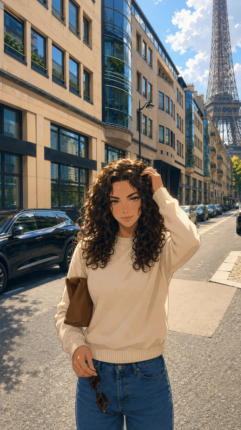
Contemporary anime finish: precise linework, layered gradients and rendered light.
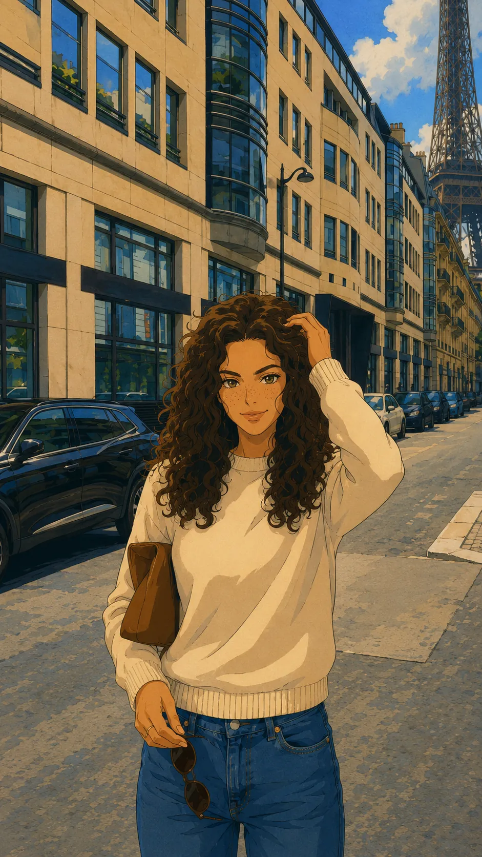
Cel-era anime with hand-inked lines, limited palettes and painted skies.
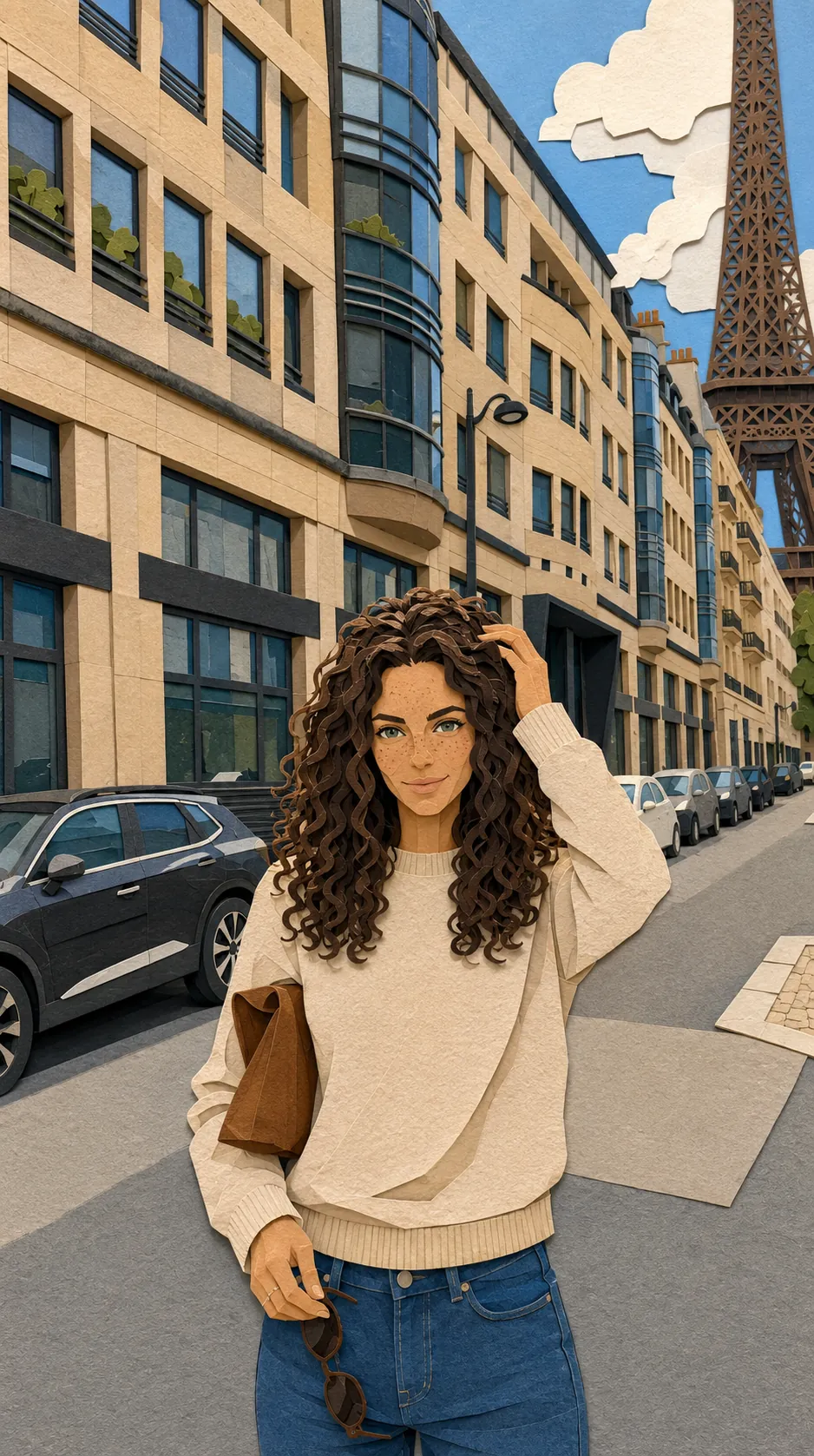
Cut paper on layers, hard edges, and visible shadow gaps between the planes.
A fabricated puppet with visible joints, real fabric and an armature under the surface.
Made with hands and materials, then photographed. Nothing here pretends to be digital.
7 of 7
Presentation-model finish: neutral materials, clean bases, scale figures and studio lighting.
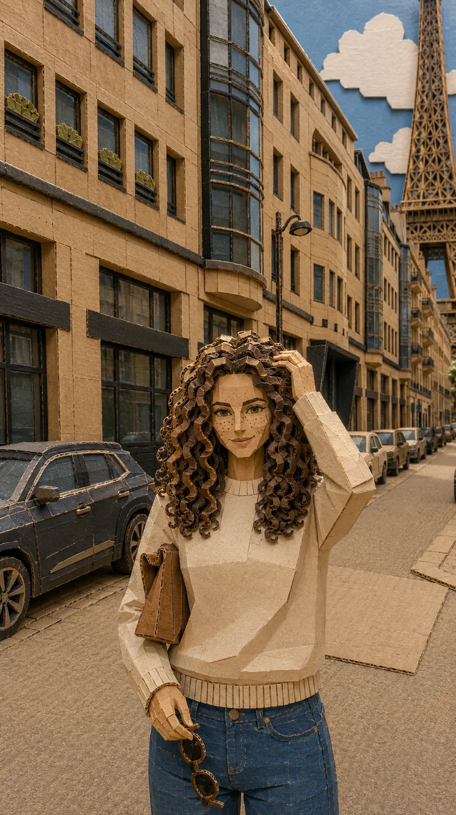
Corrugated edges, exposed flutes and hand-cut tabs. The city as a weekend project.
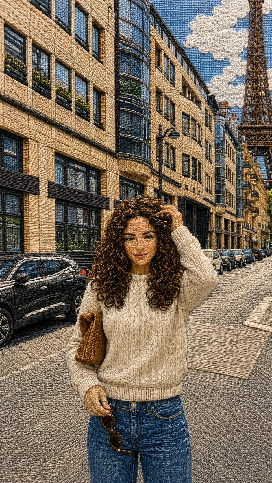
Satin stitch, visible thread direction and a weave that shows through. The whole frame as needlework.
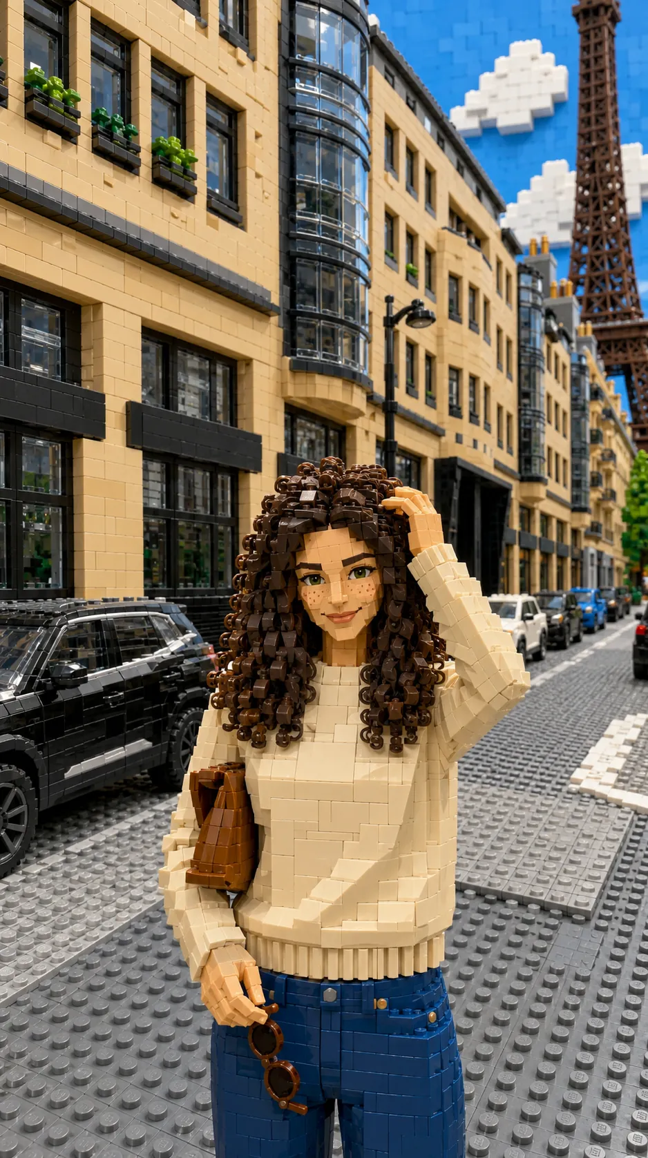
Studded plastic, moulded hands and visible seams. Every surface becomes something you could stand on and regret.
A built miniature with real depth of field, where the tell is the scale of the dust.
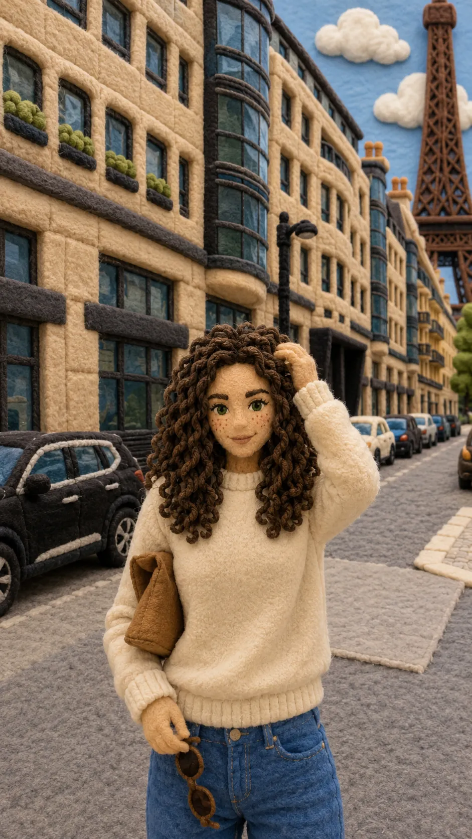
Stitched felt, embroidered features and stuffed volume, with the street rebuilt as soft goods.
Built rather than rendered: foam, paint, glue and forced perspective, lit like a real set.
Marks on a surface: ink, graphite, pigment, pressed plates and printing ink.
10 of 10
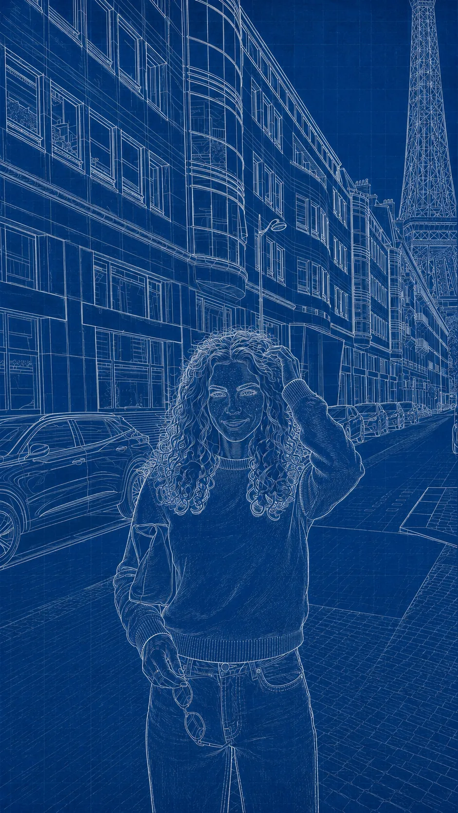
White line on cyanotype blue, dimensioned and annotated like something meant to be built.
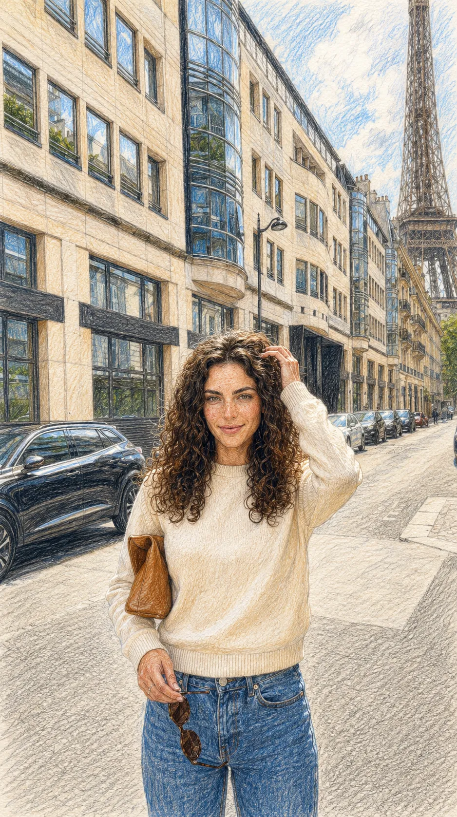
Layered coloured pencil, visible hatching direction and the tooth of the paper showing through.
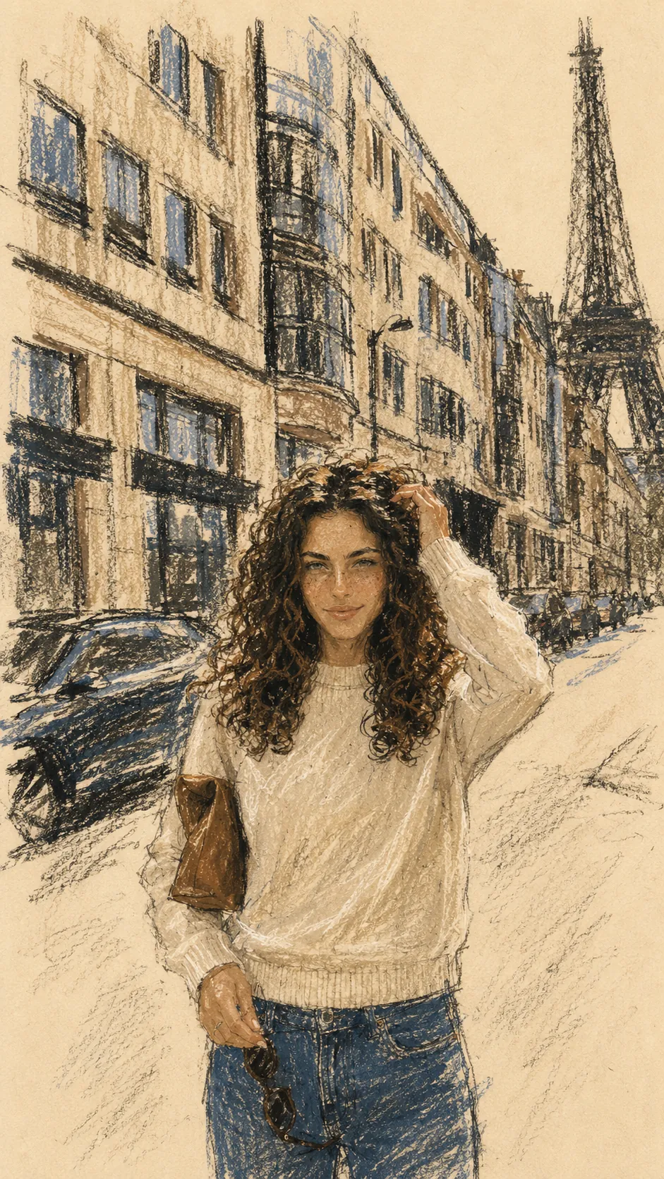
Wax crayon, oil pastel and charcoal on warm cream stock, worked fast and left rough.
Graded graphite, worked tone and paper grain, with highlights lifted rather than left.
Carved marks, hard black fields and the chatter of a blade in lino. Reduction printing, not filtering.
Fast, searching pencil work with the construction lines left in, and the confidence to leave them.
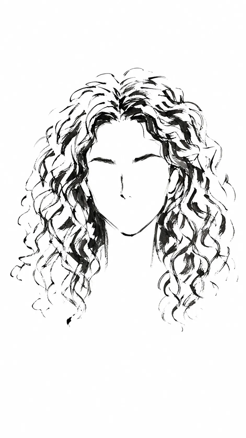
A single continuous contour describing the whole scene with the fewest possible marks.
One weight of ink, no shading, no tone. The composition has to survive on line placement alone.
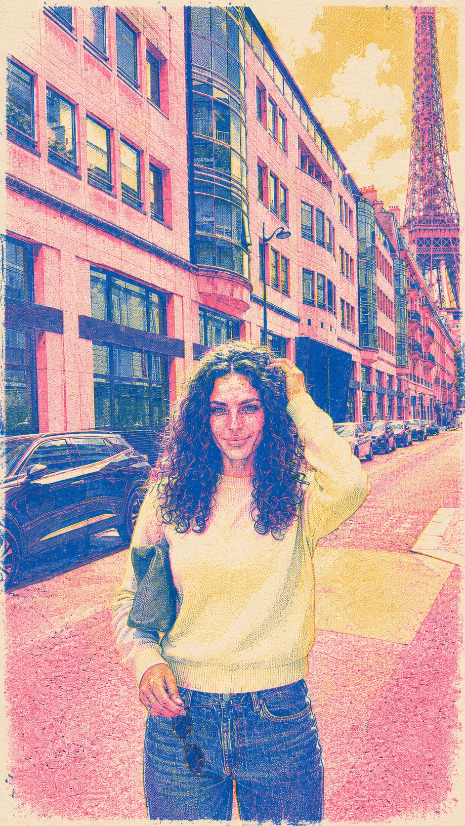
Misregistered spot colour, visible halftone and ink sitting in layers. Riso's happy accidents, on purpose.
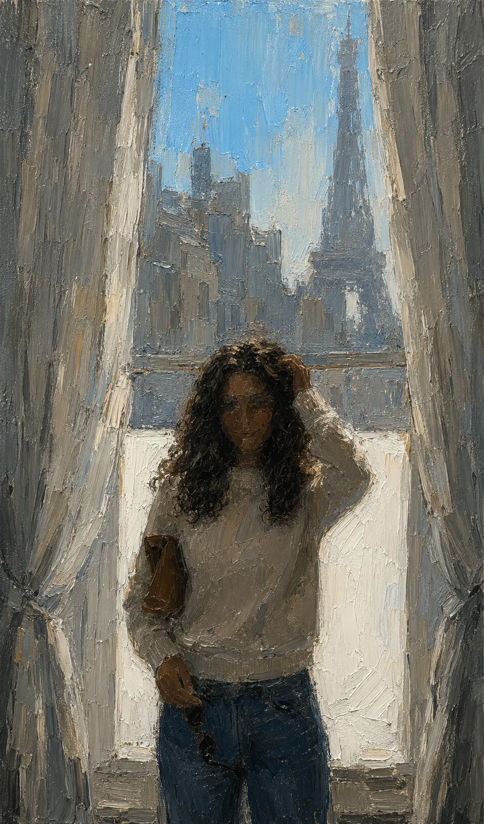
Loaded brush, visible ridges, pigment sitting proud of the weave. Colour mixed on the surface rather than the palette.
What different sensors and lighting actually see, from infrared through to radiography.
6 of 6
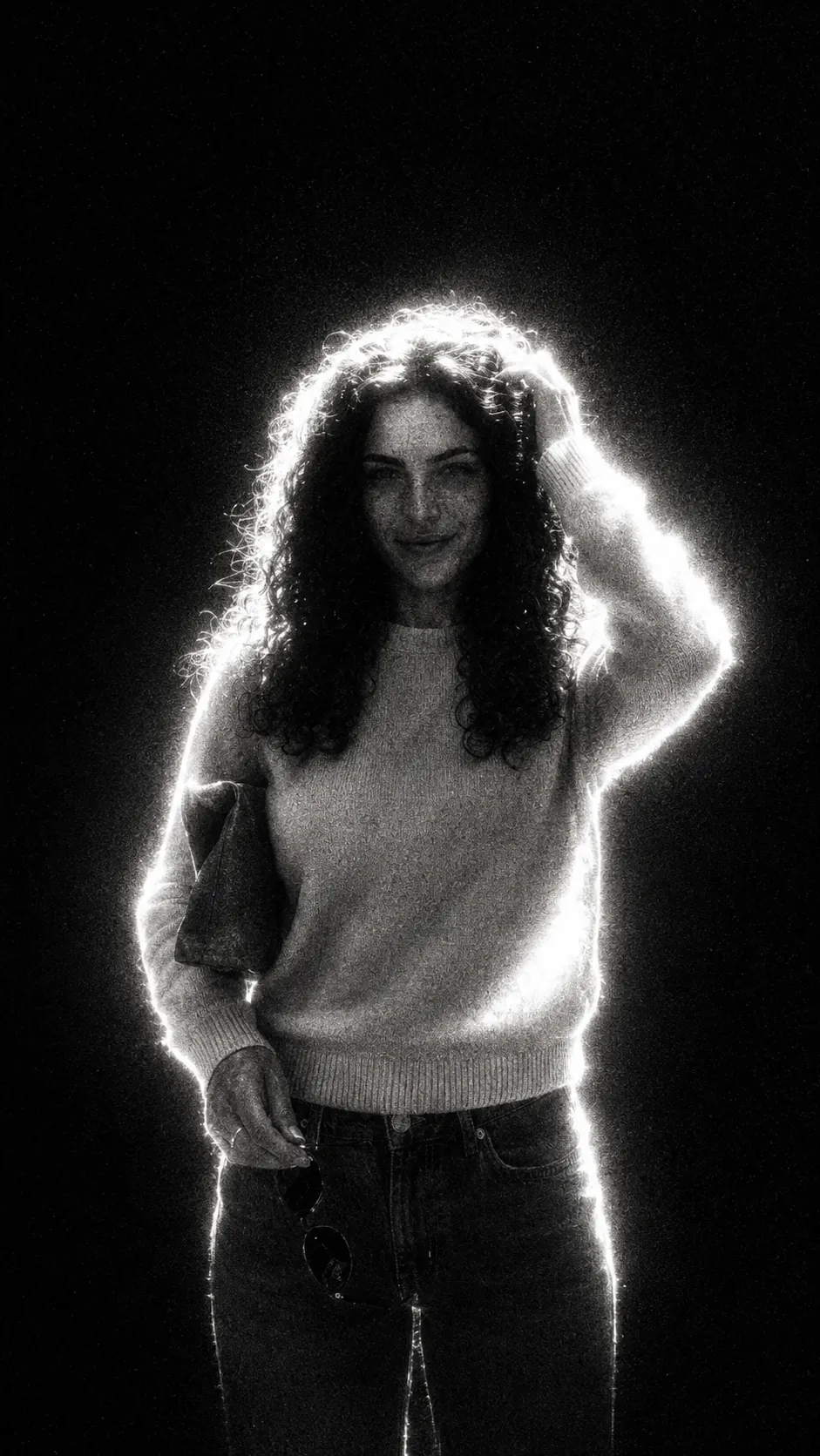
Extreme backlight, blown highlights and a white rim separating the subject from near black.
False-colour infrared: foliage goes white hot, sky goes deep, skin turns waxen.
Near-silhouette exposure against a blown background, holding just enough detail to read.
High-contrast black and white with motion smear, treating a still street as a study in movement.
Image-intensifier green, blown highlights and sensor grain, as though shot through a scope.
Radiographic inversion: dense material bright, soft tissue faint, everything reduced to what it stops.
The renderer showing its work: depth, topology, viewports and the look of older hardware.
5 of 5
Edges only. Structure, topology and the geometry underneath, with nothing shaded.
Gouraud shading, low texture resolution and the plastic sheen of rendering circa 1995.
Solid-mode viewport: matcap shading, no textures, geometry read purely as form.
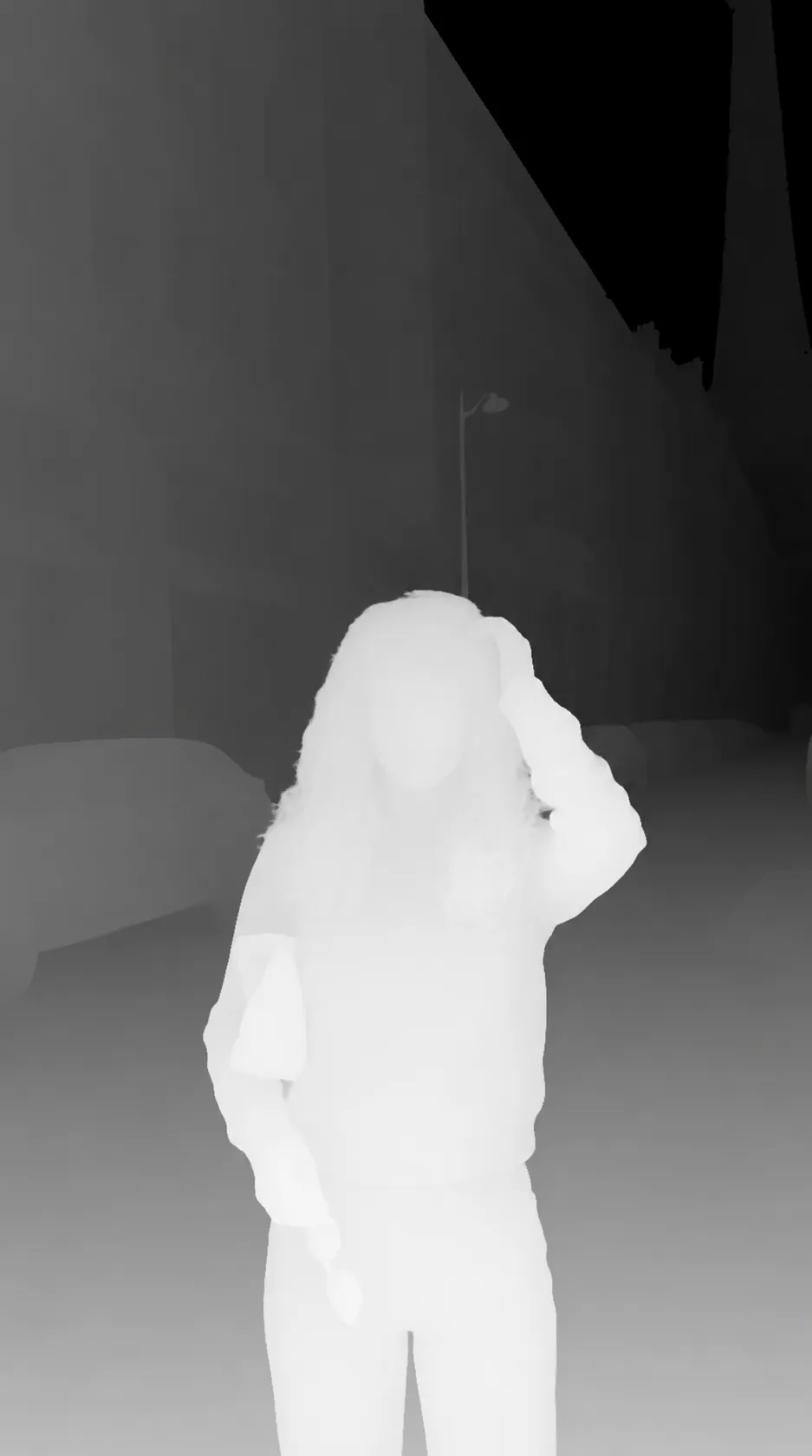
Pure depth encoded as luminance. No texture, no colour, only how far away everything is.
Chrome gradients, lens flare and iridescent plastic. The future as it looked around 1999.
One material substituted for everything, so the scene reads only through its surface.
3 of 3
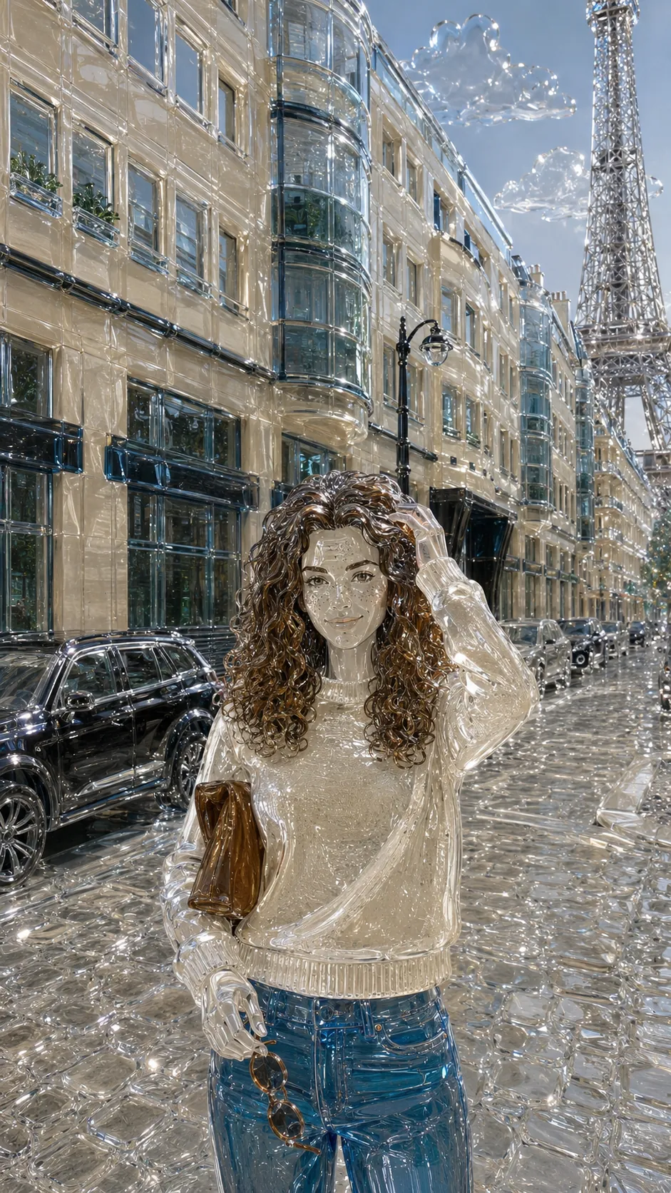
Cast and polished glass: refraction, caustics and internal reflection where solid material was.
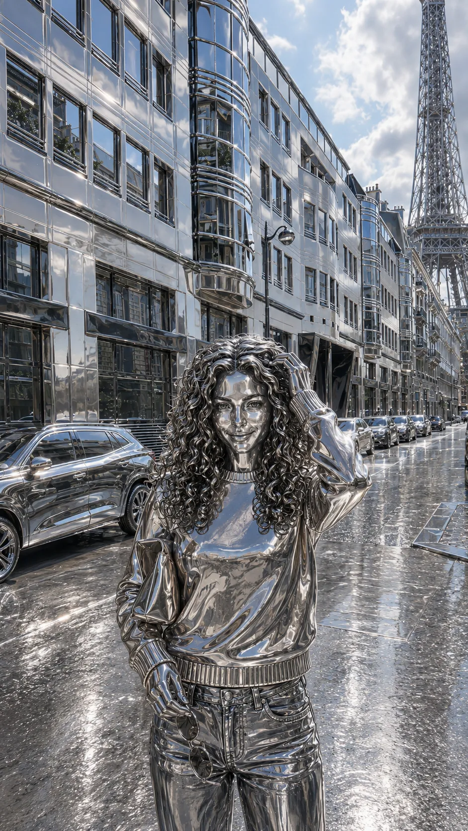
Everything remapped to polished chrome, so the scene is legible only through what it reflects.
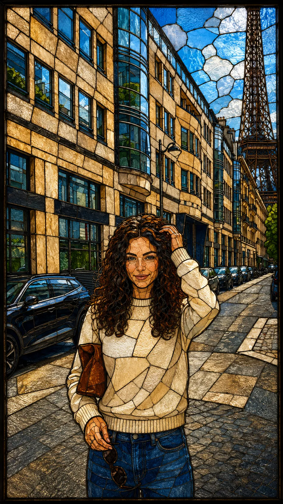
Leaded sections, saturated glass and light arriving from behind rather than in front.
Nothing matches that. Clear the search, or pick a family.
The rest of the same argument
Founding access
Every frame here came out of the same discipline Transora is built around: decide what has to survive before you generate anything, write it down, and hold the model to the list. Not all 50 hold the same things, and they should not. A wireframe has no lighting to keep.
What the 50 have in common is that the decision came first. Doing that by hand is a long prompt per frame, a lot of rejected output, and the discipline to write the list out again every single time. The product exists so the list is the default rather than the homework.
What this prompt pins down
This one is written as a look to hit rather than a list to protect.