Case study · Brand identity
Rushmere Plumbing & Heating
A UK plumbing and heating firm needed an identity as dependable as the work itself. The answer is one mark, flame and wrench fused, commissioned as a logo, a poster, and a shirt print, and built so it could grow well past that brief.
In one line
A trade identity built around a flame and wrench mark, designed to read instantly on a poster, a shirt, or a door, and to keep reading right as the company grows.

The idea
The trade, made into one mark.
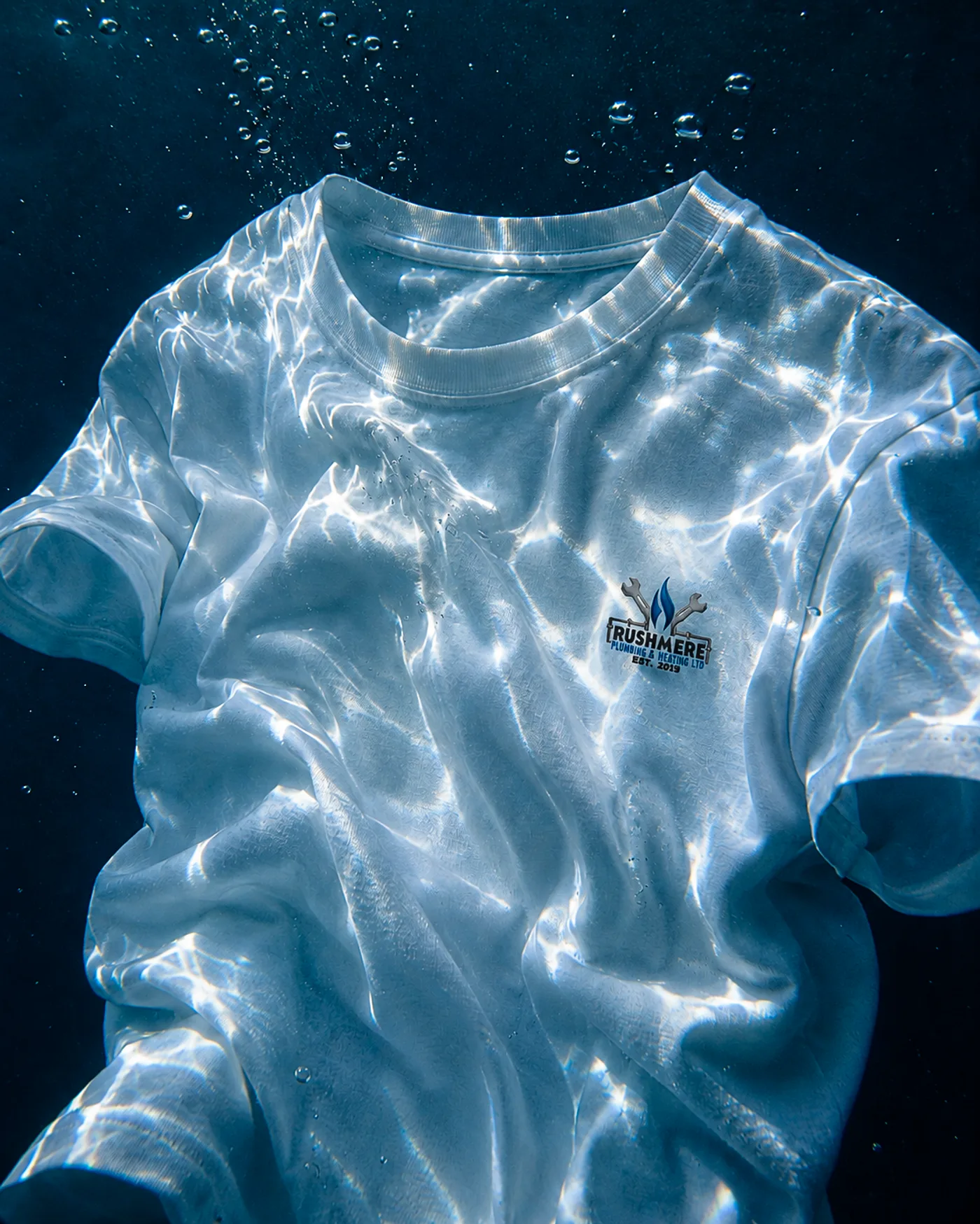
Plumbing and heating is two promises in one visit: water handled, warmth restored. The mark fuses them. A blue flame rises between crossed wrenches, and the pipework becomes the typography's underline. Nothing decorative sits on top; every element in the lockup is a tool of the job.
The palette does the trust work. Deep navy carries the engineering weight, steel and chrome carry the workshop, and the flame's blue keeps heat away from danger-red. It is a palette a customer reads as calm competence before a word is exchanged.
The system
Two registers, one identity.
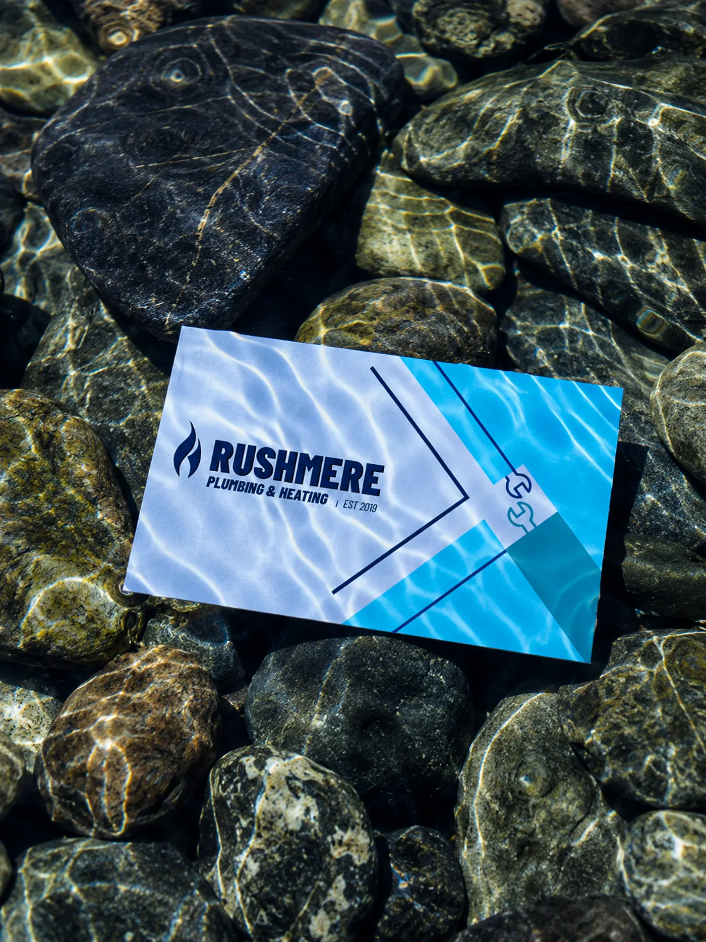
A dimensional lockup fronts the customer surfaces. A flat geometric system runs the print, with the flame reduced to its purest cut. The card and roundel were built as system extensions, proof the identity scales past its commission.



In the world
Applications, shot underwater.
The application set is photographed in the element the trade actually works in. Caustic light, moving water, real cotton. It is the one place a plumbing identity can be shown doing the thing it claims, and it settles the question of whether the mark survives a difficult surface.

What it did
Commissioned by a working trade business as a logo, a poster, and a shirt print. Delivered with the system extensions above, so the identity can grow without being redrawn. It has run since without supervision, which is the only review a trade identity needs.