Case study · Concept identity
Zone
A self-initiated identity for a training apparel brand. The wordmark is built from a box it refuses to stay inside: the O carries a slash that cuts through the frame, and that single gesture is the whole identity. Territory, marked and broken.
In one line
A monochrome wordmark system for a training apparel concept: heavy geometric capitals inside a keyline frame, with a slash through the O that breaks the box and gives the name its edge.
The idea
Mark the territory, then break it.
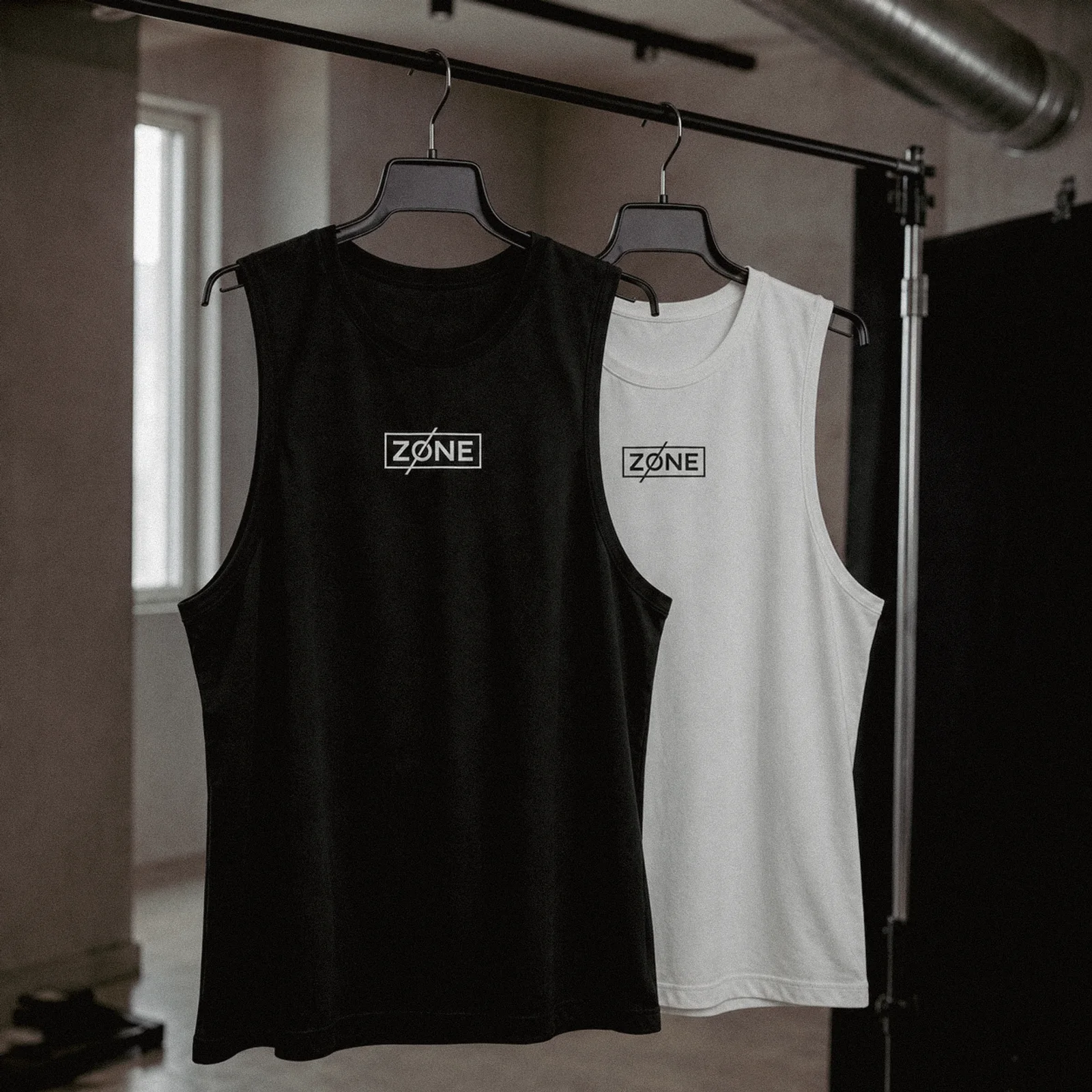
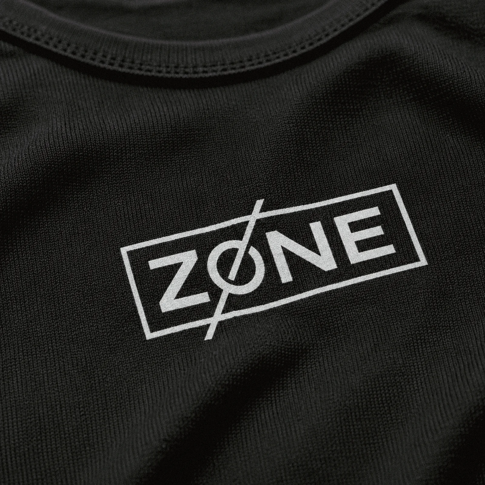
A zone is a boundary. In training it is also a state: the place you go when the noise stops. The identity takes both literally. The name sits inside a drawn frame, claimed like floor space, and the slash cuts through the O and out of the box, because the whole point of a training brand is crossing your own limits. One gesture carries the meaning, which is why the mark needs no colour, no gradient, and no second element.
Monochrome is the discipline. Black and off-white survive every surface the mark meets: fabric, signage, print, screen. Where the world adds colour, the mark keeps its silence.
The system
Built on the grid, cut off it.
The construction grid sets the frame, the letter weights, and the slash angle. Every break from the grid is deliberate, and there is exactly one.


In the world
One location, one grade, one language.
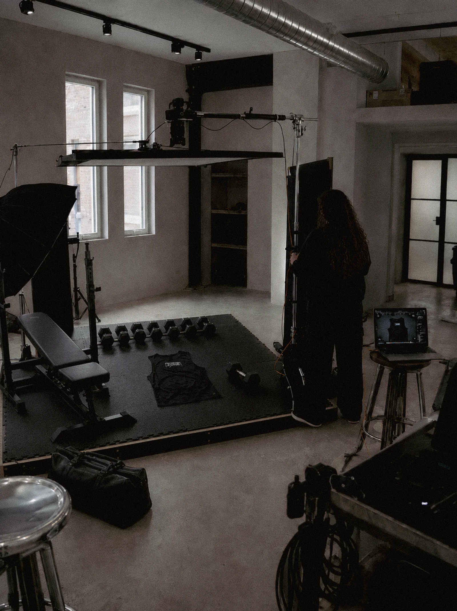
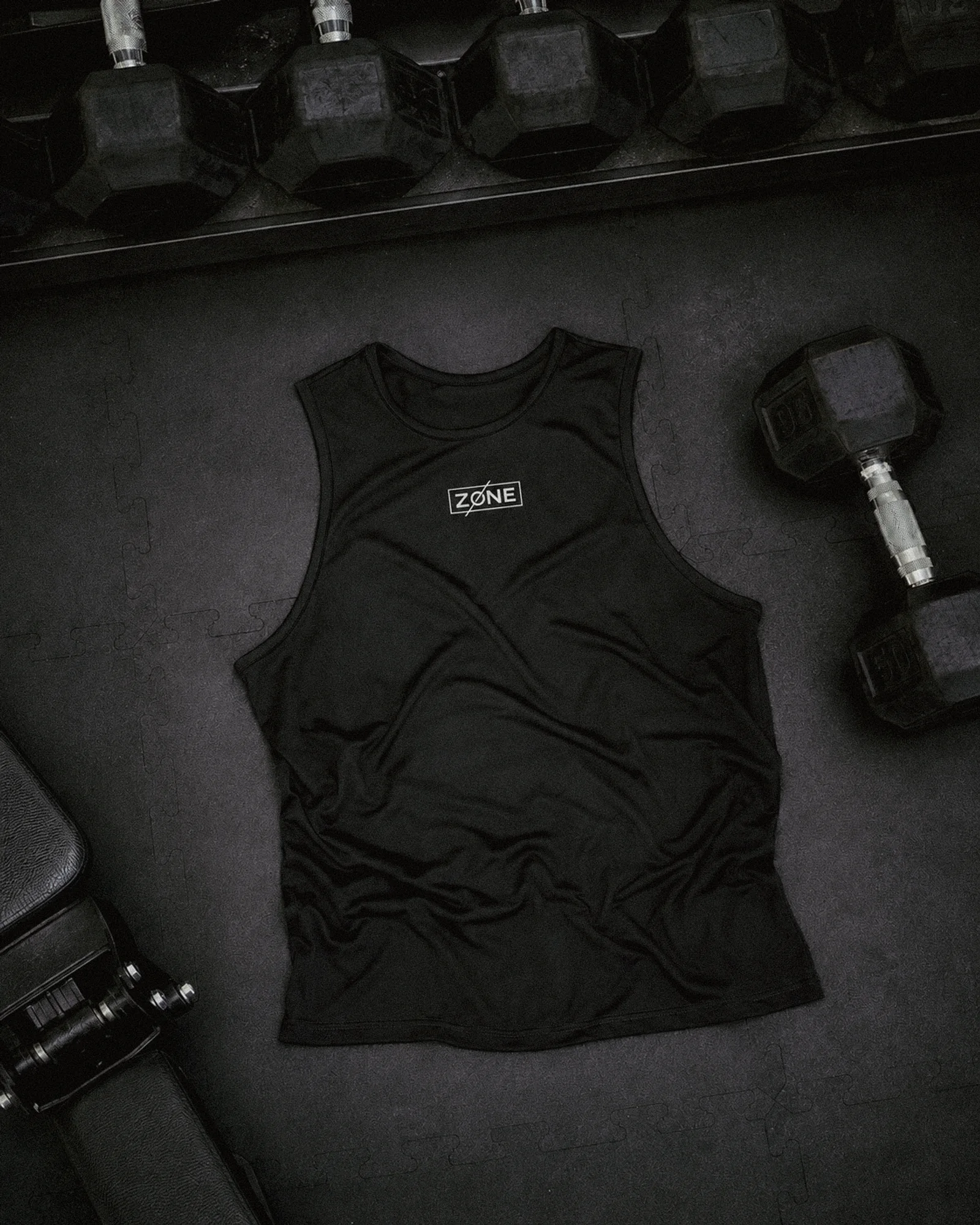
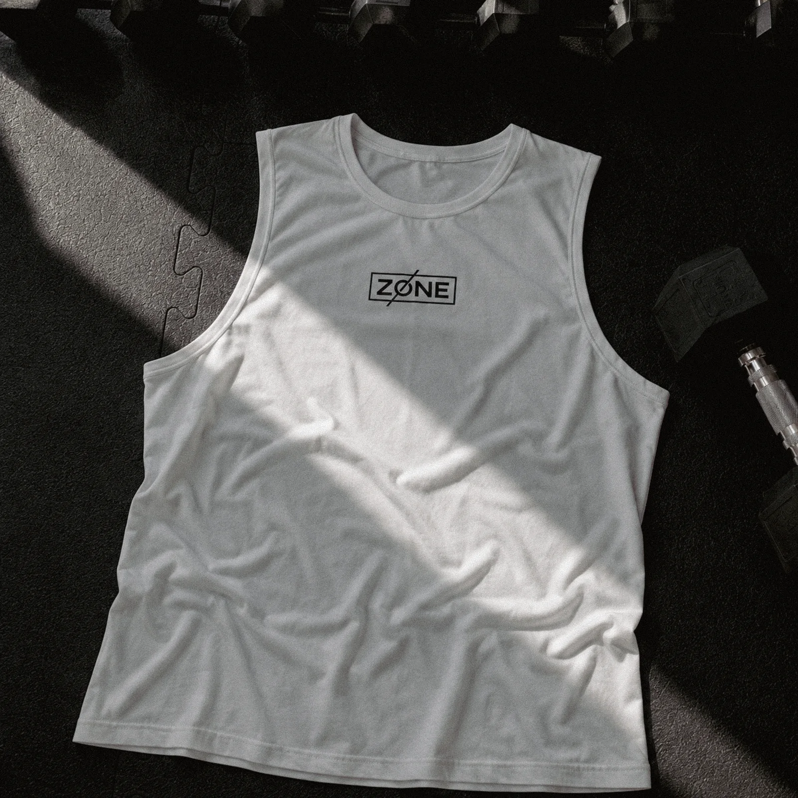
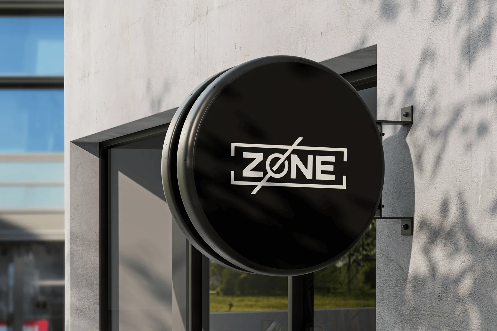
Every application frame shares the same room, the same light, and the same restraint: concrete, steel, and the two shirt colours. The identity is never asked to shout over its own photography.
What it proves
Concept work, held to delivery standard: mark, construction grid, reversed set, garment applications, signage, and a single visual language across every frame. Nothing here was softened by a client compromise, which is exactly why it belongs in the archive: this is the judgment, undiluted.